Arjen Vrielink and I write a monthly series titled: Parallax. We both agree on a title for the post and on some other arbitrary restrictions to induce our creative process. For this post we agreed to include our personal browser histories in the post. You can read Arjen’s post with the same title here.

If you are not interested in Browsers and/or usability, I would suggest you don’t bother to read this post.
I cannot exactly remember the first time I used the Internet. It probably was in 1996 in the library at the Universiteit Utrecht. I wasn’t particularly aware of the browser I was using, but I am quite sure that is was Netscape Navigator with which I did the Altavista searches. I used Netscape throughout my education, only to switch to Internet Explorer 5 when I got my own computer with Windows 98 and a dial-up Internet connection. I then used nothing but IE until I read about Mozilla Firefox in a magazine in 2004. Through Moodle I had started appreciating open source software and I liked working with Firefox and its tabs. I stuck with Firefox for a year or so, feeling quite the rebel whenever a site would only load in IE. At some point I noticed how much faster IE was than Firefox. That is when I switched to Avant Browser, a freeware skin around the IE browser engine which included tabs and some other advanced features. A little while later (somewhere in late 2005 or early 2006) I learnt about Opera. Opera had a lot of appeal to me. I liked how their developers pushed so many innovations in the browser space: tabbed browsing, advanced security features and mouse gestures were all inventions of Opera. I loved how fast it was and how many features they managed to cram in so little megabytes. Its cross platform nature allowed me to stay with Opera when I permanently switched to Ubuntu in the summer of 2006. I switched back to Firefox in early 2007 because of my slightly more hardcore open source attitude and because of its wonderful extensions. The latter allowed me to keep all the functionality that I loved about Opera and more.
About two weeks ago I switched to Chromium. This is Google’s relatively new open source offering in the browser market. I am able to automatically download new builds every day through the PPA for Ubuntu Chromium Daily Builds. Even though it is still beta alpha software, it is highly usable.
So why did I switch? I think there are three reasons:
1. Performance
Since a couple of months my private computing is done with a Samsung NC10. This Intel Atom based netbook is slightly underpowered. You really notice this when you are doing things like recoding a video or doing some CPU intensive image editing. I also noticed it terribly in Firefox. Things like Google Reader, DabbleDB (watch that 8 minute demo!) and the WordPress admin interface were nearly unusable. A cold start of Firefox (the 2.x version that comes with Ubuntu 9.04) takes nearly a minute. Chromium on the other hand starts up in a couple of seconds and is very spiffy with Javascript-heavy web-apps.
I tried to quantify my unmistakable feelings with some benchmarking. I used Peacekeeper, but Firefox could not finish the benchmark and would crash! I then used the Sunspider Javascript benchmark and got a total score of 3488.8ms for Chromium and a total score of 18809.6ms for Firefox. This means that in certain cases Chromium would load something in less than one fifth of the time that Firefox 2.x will load it.
While writing this post I decided to try installing Firefox 3.5 (without add-ons) and see how that would perform. After a sudo apt-get install firefox-3.5 I could start Firefox by selecting “Shiretoko Web Browser” in the “Internet” menu. The total score was 5781.2ms, a major improvement, but still more than one and half times slower than Chromium. Its interface is also still less responsive than I would like it to be.
Another nice aspect about Chromium’s performance is that each tab is its own process. This so called Multi Process Architecture isolates problem webpages so that one Flash page crashing does not affect the other browser tabs, something that happened very often to me with Firefox.
2. Screen Real Estate
Another thing that a netbook lacks is pixels. My screen is 1024 pixels wide and 600 pixels high. Especially the lack of height is sometimes taxing. I have done a lot of things in Ubuntu to mitigate this problem (if you are interested I could write a post about that) and I had to do the same with Firefox.
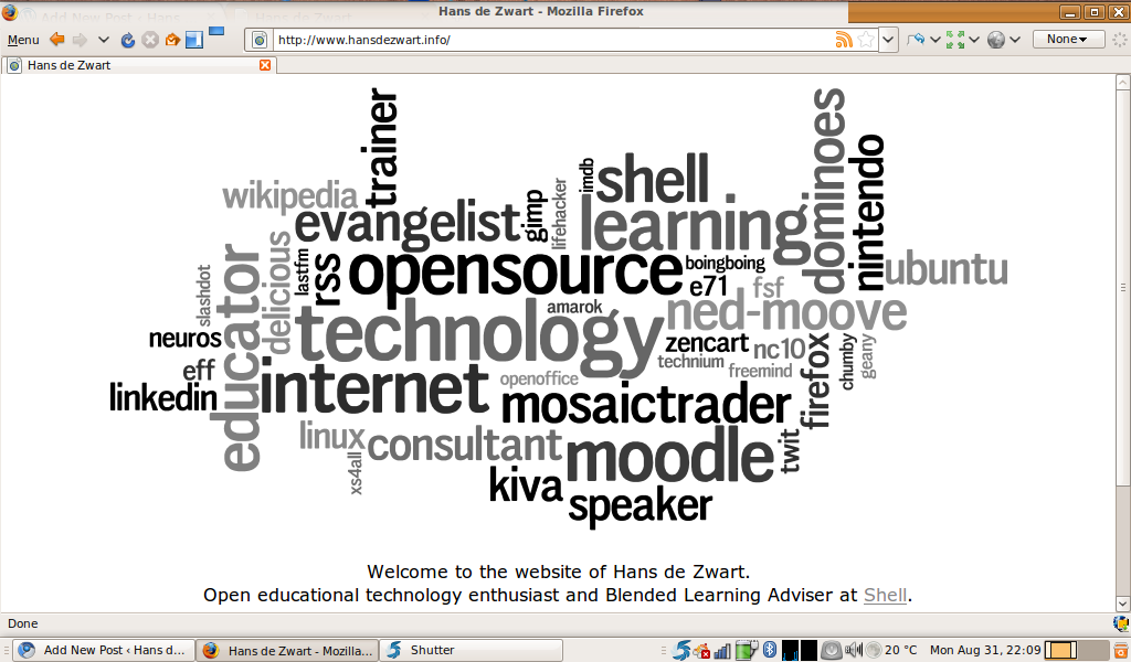
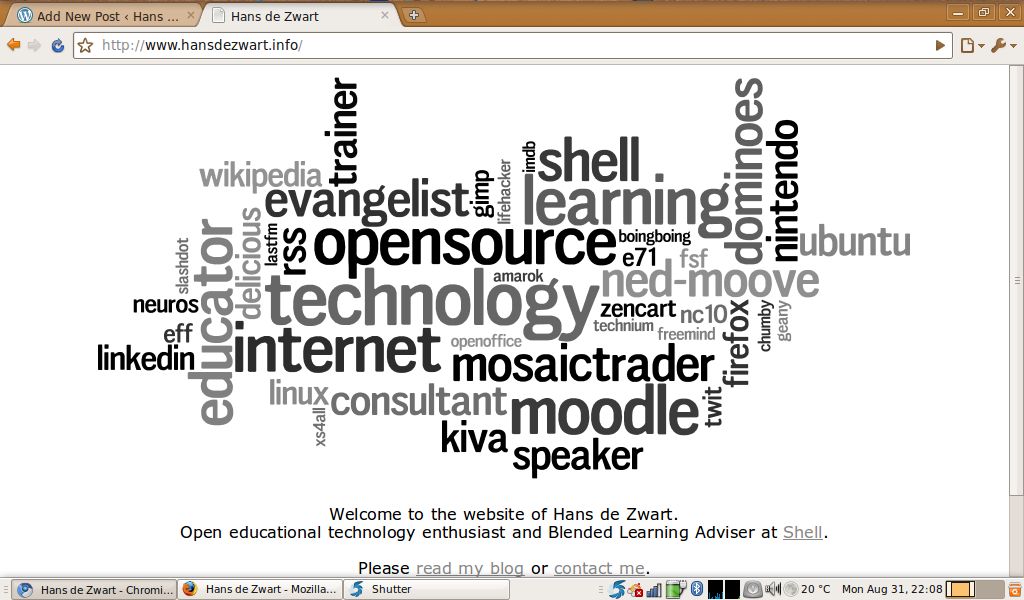
In Firefox I used Tiny Menu, chose small icons, used no bookmarks and combined many toolbars into one to make sure that I have more content and less browser. To my surprise I had to do nothing with Chromium and still got a bigger canvas with a bigger font in the address bar! Compare the screenshots below to see the differences:


Chromium shows more of the page and accomplishes this by doing a couple of smart things:
- There is no status bar. I could have turned the status bar off in Firefox, but I need to see where a link is pointing to before I click on it. Chromium shows this information dynamically as soon as you hover over a link. When you don’t hover it shows nothing.
- The tabs are moved into the title bar. It looks a bit weird for a while, but it uses some very valuable space.
- Some things only appear when you need them. The bookmark bar, for example, only shows up when you open a new tab.
3. It is a fresh look at what a browser should/could be
Most of my time behind my computer is spent using a browser. More and more of the applications I use daily have moved into the cloud (e.g. mail and RSS reading). It is thus important to have a browser that is made to do exactly those functions.
The developers of Chromium have looked at all aspects of a traditional browser and have rethought how they work. A couple of examples:
- The address bar is actually a tool with four functions. It contains your web history, typing some terms will execute a search in your default search engine (saving me two characters compared to how I search in Firefox), you can type a normal web address and you can use keywords to search. If I type w chromium in the address bar it will search for chromium in Wikipedia. The keyword search also works in Firefox, but Chromium has a prettier and more clear implementation.
- When you open a new tab, you see a Dashboard of sites you use often (a variant of another Opera invention). That page also conveniently displays recently closed tabs with a link to your browsing history. The history page has excellent search (it is Google after all!) and has that simple Google look.
- The downloads work in a particular way. They automatically save in a default location unless you tick a box confirming that you always like to open that type of file from now on. This takes a little getting used to (I like saving my downloads in different folders), but once again the download history is searchable and looks clean.
In conclusion: Chromium is a browser in which some hard choices were made. No compromises. That means that I, as a user, have to worry about less choices and settings and can focus on being more productive. Making tough interface design choices can be a very successful strategy: witness Apple’s iPod.
For now I will be using Chromium as my primary browser and will use Firefox when I need certain functionalities that only Firefox add-ons can provide.
I am looking forward to what the browser future holds!
Hi Hans,
thank you so much for this post. It made me install Chromium on my Ubuntu netbook and the startup and page load times are indeed a lot faster than firefox. Chromium is especially useful on the netbook since it is very economic on screen real estate.
So thanks again!
Best,
Stephan
Glad you liked it Stephan! I guess you did not heed to my advice at the beginning of the post… 😉
You can go ‘wrench’ > Options > Under the Hood > and check ‘[] Ask where to save each file before downloading’.
Is it wrong for me to take so much pleasure in using chromium? 😉
Thanks Lightbreeze, I’ll try and find that option.
Either I missed it earlier or it wasn’t/isn’t there yet (I don’t think the daily Chromium Ubuntu build is fully feature complete yet), we’ll see!
Thanks for sharing this with me Lightbreeze. There is a small usability problem there. I hadn’t noticed the scrollbar in that option window: I suddenly discovered a whole bunch of extra options. Good to find them, shame to of Chrome to go against the conventions there.