What Makes Goodreads a Great Website?

Arjen Vrielink and I write a monthly series titled: Parallax. We both agree on a title for the post and on some other arbitrary restrictions to induce our creative process. This time we decided to write about what makes Goodreads a great website. First we sat together for an hour and used Gobby to collaboratively write a rough draft of the text. Each of us then edited the draft and published the post separately. You can read Arjen’s post with the same title here.
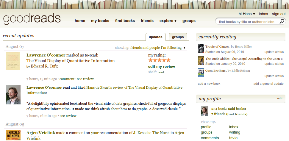
Goodreads.com
Goodreads.com

What is Goodreads?
Goodreads is Facebook and Wikipedia for readers: a social network of people that love to read books, full of features that readers might like. It allows you to keep many “shelves” with books that can be shared with other people on the site.

Great Features
Here are some of the features (in no particular order) that make Goodreads work so well:

  • The site is not only useful when you are a member. Even if you are not logged in it still is a pleasant site to read and browse for book lovers.
  • It allows you to keep track of your own, yout friends and “the crowds” books. If you see an interesting book you can put it on your to-read shelf, if a friend reads an interesting book than he or she can recommend it to you.
  • Statistics can suggest recommendations based on my shelves, reviews and friends.
  • There is a distinction between friends (a symmetric relationship) and followers (an assymetric relationship).
  • There is a book comparison feature: it finds the books you have both read and compares the scores you have given to those books.
  • It is very easy to invite your friends into the site. You can put in their email address, or you can give Goodreads access to your webmail contacts (sometimes this is a questionable thing, but Goodreads isn’t to pushy (it doesn’t send out Tweets without you knowing it for example)).
  • They have a great “universal” search box where you can search books on author, title or isbn from the same field.
  • It makes use of Ajax in the right locations, allowing you to update small things (“liking” a review, noting what page you’ve reached, handing out stars to a book) without having to reload the page.
  • The user profile page is related to the contents of the webservice: for example, it allows you to say who your favourite authors are.
  • The site supports many different ways of viewing and sorting your shelves. You can look at covers or at titles and sort by author, by score, by last update and more.
  • Before building a great iPhone app, Goodreads made sure their website had a great mobile version of their website. When you access the website with a mobile browser it automatically redirects to a mobile version of the website, so even if you are accessing the site with your Windows Mobile device you have a great experience.
  • Not only is it very easy to put data into the Goodreads ecosystem, it is also very easy to get your data out again. You can download a CSV file with all your books (including the data you added like reviews, date read, your rating and the metadata about the book that Goodreads has added like the ISBN or the average rating). The smart import feature looks at an HTML page (e.g. an Amazon wishlist page) and imports all the ISBNs it can find in the source code of the page. Like any good webservice it imports files that are exported from their competition (Shelfari, Librarything and Delicious library).
  • There seems to be an evolving business model. Initially there were only (onubtrusive) adds, but now they are starting to sell e-books, integrating this into the social network.
  • Often when you read a book there are sentences or passages which really impress or inspire. Most of the times you then forgot these. Goodreads allows you to favourite and rank (and thus collect) quotes easily by author or by book. You can add and export quotes as well.
  • Sharing your Goodreads activity to other important webservices is built in. There are integrations with Facebook, Twitter, WordPress Blogs and MySpace. Goodreads also provides embeddable widgets that you can put on another website (e.g. a box with the most recent books you have read). A simple integration allows you to instantly find a book that you are looking at in Goodreads in your favourite online bookstore. And of course there is the ubiquitous RSS.
  • A site like Goodreads get is value from the data that its users put in. Goodreads allows this at many levels. There are trivial ways of adding information (i.e. saying you like a review by clicking a single link, allowing Goodreads to display useful reviews first), but there are also ways of adding information that take slightly more effort. For example, it is fairly easy to get “librarian” status which shows the site trusts their users. As a librarian you can edit existing book entries. A low entrance level is key to crowd sourcing. Another way to involve people is to allow them to add their own trivia that other users can try and answer in trivia games.
  • It allows users to flag objectionable content.
  • Goodreads has its own blog, keeping you up to date about the latest features and their direction.
  • It has an element of competition, you can see how many books are on your shelf and how many books are on other people’s shelf, but there are more metrics: you can see who has written the most popular reviews, your rank among this week’s reviewers, or who has the most followers
  • It has a great and open API. This allows other people to build services on top of Goodreads. The potential for this is huge (the very first Goodreads iPhone app was not made by Goodreads itself, but was made by a Goodreads enthousiast) and I don’t think we have seen what will be possible with this yet. A lot of the data that Goodreads collects is accesible through the API in a structured and aggregated form. It should be very easy for other book related sites to incorporate average ratings from Goodreads on their own pages for example.
  • It is in continual beta and their design process seems to be iterative: it keeps evolving and adding new features at a high frequency like the recently added stats feature.

My current stats for 2010
  • It is easy to delete your account, deleting all your data in the process. This makes for complete transparancy about data ownership, an issue that other sites (Facebook!) have been struggling with lately.
  • It has a kind of update stream which let’s you easily keep up to date with your friends, groups and favourite authors status.
  • The service has ambitious and lofty goals: “Goodreads’ mission is to get people excited about reading. Along the way, we plan to improve the process of reading and learning throughout the world.” (see here). I do believe that this clear mission has led to many features that wouldn’t have been there otherwise. For example, there is a book swap economy built into the site allowing people to say that they own the book and are willing to swap it for other books. Another book lovers feature are the lists. Anybody can start a list and people can then vote to get books on the list. Examples of list are The Movie was better than the Book or Science books you loved. Another feature are the book events. You can find author appearance, book club meetings, book swaps and other events based on how many miles away you want these to be from a certain city or in a certain country. Of course you can add events yourself, next to the ones that Goodreads imports from other sites, and you can say which events you will attend, plus invite friends to these events.

How Goodreads could improve
As said, Goodreads is continuously changing, there are still some things that require some change in the right direction:

  • Ocassionally the site feels a bit buggy. I have had a lot of grief updating the shelves of books using the mobile site with it not doing the things I wanted it do.
  • It is not always clear what kind of updates are triggered by an user action. I am not sure what my friends see. Sometimes you find your Facebook Wall flooded with Goodreads updates because your friend found a box of long lost books in the attic which he entered in an update frenzy.
  • Usability: Some features are hard to find. Like the new stats feature discussed above, you can only find it hidden away on the bottom left of a page in some obscure menu. Other features are hard to use, requiring many more clicks than are actually necessary.
  • They could improve on localisation and on the translations of books. In your profile settings you can select your country, but you cannot select in which languages you are able to read books.
  • The graphic design of the site isn’t top notch. When people initially see Shelfari, it might have more appeal just because it looks a tad better.
  • In-app mailing or messaging systems are always beyond me. Goodreads also has an “inbox” where you can send mail to and receive mail from your Goodreads friends. I would much rather use my regular mail and use Goodreads as a broker so email addresses can be private.

Some thoughts on the process of writing this post
Gobby is a multi-platform text editor that allows multiple people to work on the same text file in realtime. It uses colours to denote who has written what.

A Gobby Window
A Gobby Window

This was an experiment to see how it would feel to work like this and whether it would be an efficient and effective way of working together. I thought it was quite successful as we produced a lot of material and helped eachother think: building on the point of the other person. It was helpful to do an initial draft, but it does require some significant editing afterwards. I thought it was interesting to see that you feel no compunction to change the other person’s spelling mistake, but that you feel less free to change the contents of what they are writing.

This time we were sitting opposite each other while writing. In the future it would be interesting (firewalls permitting) to try and do this over a longer distance. Then the unused chat-window might become more useful and important.

You can download the original Gobby file here (it requires Gobby to make sense).

Hopefully this post about Goodreads is an inspiration to anybody who tries to build a social network around a certain theme and remember: if I know you I would love nothing more than to be your Goodreads “friend”.

My Top 10 Tools for Learning 2010

CC-licensed photo by Flickr user yoppy

For this year’s edition of the Top 100 Tools for Learning (a continuing series started, hosted and curated by JaneDuracell BunnyHart of the Internet Time Alliance) I decided to really reflect on my own Learning Process. I am a knowledge worker and need to learn every single day to be effective in my job. I have agreed with my manager to only do very company-specific formal training. Things like our Leadership development programs or the courses around our project delivery framework are so deeply embedded in our company’s discourse that you miss out if you don’t allow yourself to learn the same vocabulary. All other organised training is unnecessary: I can manage myself and that is the only way in which I can make sure that what I learn is actually relevant for my job.

So what tools do I use to learn?

1. Goodreads in combination with Book Depository
The number one way for me personally to learn is by reading a book. When I started as an Innovation Manager in January I wanted to learn more about innovation as a topic and how you could manage an innovation funnel. I embarked on a mission to find relevant books. Nowadays I usually start at Goodreads, a social network for readers. I like the reviews there more than the ones on Amazon and I love the fact that I can get real recommendations from my friends. Goodreads has an excellent iPhone app making it very easy to keep a tab on your reading habits. I found a bunch of excellent books on innovation (they will get a separate post in a couple of weeks).
My favourite book store to buy these books is Book Depository (please note that this is an affiliate link). They have worldwide free shipping, are about half the price of the book stores in the Netherlands and ship out single books very rapidly.

2. Twitter and its “local” version Yammer
Ever since I got an iPhone I have been a much keener Twitter user (see here and guess when I got the iPhone). I have come to realise that it is a great knowledge management tool. In recent months I have used it to ask direct questions to my followers, I have used it to follow live news events as they unfold, I have searched to get an idea of the Zeitgeist, I have used it to have a dialogue around a book, and I have used it as a note taking tool (e.g. see my notes on the Business-IT fusion book, still available thanks to Twapperkeeper).
Yammer is an enterprise version of Twitter that is slowly taking off in my company. The most compelling thing about it is how it cuts across all organizational boundaries and connects people that can help each other.

3. Google
Google does not need any introduction. It is still my favourite search tool and still many searches start at Google. I have to admit that those searches are often very general (i.e. focused on buying something or on finding a review or a location). If I need structured information I usually default to Wikipedia or Youtube.

4. Google Reader
I have about 300 feeds in Google Reader of which about 50 are in my “first read” category, meaning I follow them religiously. This is the way I keep up with (educational) technology news. What I love about Google Reader is how Google has made a very mature API available allowing people to write their own front-end for it. This means I can access my feeds from a native iPhone app or from the web or from my desktop while keeping the read counts synchronised. Another wonderful thing is that Google indexes and keeps all the feed items once you have added the feeds. This means that you can use it to archive all the tweets with a particular hash tag (Twitter only finds hash tags from the last two weeks or so when you use their search engine). Finally, I have also used Google Reader as a feed aggregator. This Feedburner feed, for example, was created by putting three different feeds in a single Google Reader folder (more about how to do that in a later post).

5. Wikipedia (and Mediawiki)
The scale of Wikipedia is stupefying and the project still does not seem to run out of steam. The Wikimedia organization has just rolled out some enhancements to their Mediawiki software allowing for easier editing. The openness of the project allows for people to build interesting services on top of the project. I love Wikipanion on my iPhone and I have enthusiastically used Pediapress a couple of times to create books from Wikipedia articles. I find Wikipedia very often (not always!) offers a very solid first introduction to a topic and usually has good links to the original articles or official websites.

6. Firefox
Even though I have written earlier that I was a Google Chrome user, I have now switched back and let Mozilla’s Firefox be the “window” through which I access the web. This is mainly due to two reasons. The first being that I am incredibly impressed with the ambitions of Mozilla as an organization. Their strategy for making the web a better place really resonates with me. The other reason is Firefox Sync, allowing me to use my aliased bookmarks and my passwords on multiple computers. I love Sync for its functionality but also for its philosophy: you can also run your own Sync server and do not need to use Mozilla’s and all the sync data is encrypted on the server side, needing a passphrase on the client to get to it.

7. LinkedIn
It took a while before I started to see the true benefits of LinkedIn. A couple of weeks ago I had a couple of questions to ask to people who have experience with implementing SAP Enterprise Learning in large organizations. LinkedIn allowed me to search for and then contact people who have SAP Enterprise Learning in their profile in some way. The very first person that I contacted forwarded me on to a SAP Enterprise Learning discussion group on LinkedIn. I asked a few questions in that forum and had some very good public and private answers to those questions within days. In the past I would only have access to that kind of market information if SAP would have been the broker of this dialogue or if I would buy from analysts like Bersin. LinkedIn creates a lot of transparency in the market place and transparency is a good thing (especially for customers).

8. WordPress (including the WordPress.com network) and FocusWriter
Writing is probably one of the best learning processes out there and writing for other people is even better. WordPress is used to publish this post, while I use a simple cross-platform tool called FocusWriter to give me a completely uncluttered screen with just the words (no menus, window edges or status bars!). WordPress is completely free to use. You can either opt for a free (as in beer) hosted version that you can set up within seconds on http://www.wordpress.com or you can go the free (as in speech) version where you download the application, modify it to your needs and host it where you want. If I was still a teacher now, this would be the one tool that I would let all of my students use as much as possible.

9. Youtube
The quantity of videos posted on Youtube is not comprehensible. It was Rob Hubbard who first showed me how you could use the large amount of great tutorials to great effect. He rightfully thought: Why would I put a lot of effort into developing a course on how to shoot a great video if I can just link to a couple of excellent, well produced, short, free videos that explain all the most important concepts? The most obvious topics to learn about are music (listening to music and learning how to play music) and games (walkthroughs and cheat codes) , but there are already lots of great videos on other topics too.

10. Moodle and the community on Moodle.org
Moodle is slowly slipping to the bottom of my list. In the last few years a lot of my professional development was centred around Moodle and I still owe many of the things I know about educational technology, open source and programming/systems administration to my interactions in the forums at Moodle.org. Two things are the cause for Moodle being less important to my own learning:
1. I now have a job in which I am tasked to try and look ahead and see what is coming in the world of enterprise learning technology. That is a broad field to survey and I have been forced to generalise my knowledge on the topic.
2. I have become increasingly frustrated with the teacher led pedagogical model that all Virtual Learning Environments use. I do believe that VLEs “are dead”: they don’t fully leverage the potential of the net as a connection machine, instead they are usually silos that see themselves as the centre of the learning technology experience and lack capabilities to support a more distributed experience.

Previous versions of my Top 10 list can be found here for 2008 and here for 2009. A big thank you again to Jane for aggregating and freely sharing this hugely valuable resource!

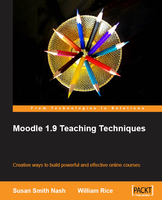
Book Review: Moodle 1.9 Teaching Techniques

Moodle 1.9 Teaching Techniques

Just over a year ago I reviewed four Moodle books published by Packt Publishing. Since then, a lot of new Moodle titles have been added to their catalogue. Richard Dias, Marketing Research Executive at Packt, has kindly sent me a copy of one of these new titles for review: Moodle 1.9 Teaching Techniques by William Rice and Susan Smith Nash, first published in January 2010.

William Rice has already published a couple of books with Packt. This book seems to be an effort by Susan Smith Nash to  build on an earlier version of the book by Rice. She adds some learning theory and instructional design essentials to the earlier text.

The fact that this is an update of a much older book, doesn’t work very well. Let me share some examples of where it goes wrong:

  • Chapter 2 used to be called “Forum Solutions”, now it has been retitled to “Instructional Material”. This is weird: Moodle’s core functionality and strongest pedagogical tool is first introduced as a way to clearly display course information and structure. Then on page 25 there is a paragraph titled “Creating a Separate Group for Each Student”. The context from the earlier book (you might want to do this to create private conversations with students) is omitted, making it a confusing set of pages.
  • Chapter 4 has a section that explains how you can exclude quiz grades from a particular quiz in the grade book. The screenshots and explanations are taken from an earlier version of Moodle and do not relate to Moodle 1.9. Moodle 1.9 has a completely different grade book (and has been released since March 2008). It is unforgivable for a book that is published in 2010 to get this wrong. I don’t understand how the reviewer missed this. Hopefully a corrected version will be published as an erratum.
  • The introduction to the book explains that  a basic level of Moodle understanding is assumed for the reader as it wants to focus on learning theory. However it then spends more than 5 (of its 193) pages on explaining what an IP address is and how it can be used to restrict access to a quiz. It gets the Linux part on how to see your IP address wrong (another one for the errata).

The book doesn’t really make optimal use of the new and advanced functionality that Moodle 1.9 has on offer. Two examples:

  • The concept of “groups” is used in the book in some descriptions of course activities (although not enough to call for its own spot in the index), but the concept of “groupings” isn’t mentioned anywhere. If I were to teach a course with Moodle tomorrow, I would definitely use this functionality as it allows you to be much more flexible in your course design.
  • Ever since Moodle 1.7 it has been possible to play with roles and capabilities in Moodle. That functionality is relatively hard to understand and needed some maturation. It is much more usable now in Moodle 1.9. This functionality is only used once in the book (during the discussion on forums) and isn’t explained well enough to my taste.

Does the book have some valuable things to offer? It is not all bad:

  • Some of the introductions to learning concepts are theories are good starting points for further exploration. For example, I liked the reference to Bruner’s “scaffolding” concept and spent some time reading the Wikipedia article on instructional scaffolding.
  • The pages on basic chat etiquette and wiki etiquette are quite useful. They describe rules you can agree on with your students to make the online learning process more pleasurable.
  • The ways of using the choice activity have been slightly expanded compared to the earlier version of the book.
  • The last chapter has a nice example of a capstone project assignment that you could adapt for your own teaching. To use the workshop module as the basis for this project assignment is a bit risky, as I would not recommend anybody to use the workshop module in its current state (Moodle 2.0 should solve that problem).

All in all I would not recommend anybody to get this book. If you have 30 euros to spend on a Moodle book (this book isn’t cheap!) choose one of the ones I recommend here. If you have a basic understanding of Moodle and are looking for generalised teaching techniques for online courses you are much better served by Gilly Salmon‘s work on e-moderation (see E-moderating and E-tivities).

Hopefully I can be more enthusiastic about the next Packt title I get to review…

The Influence of a Workspace On Performance

Arjen Vrielink and I write a monthly series titled: Parallax. We both agree on a title for the post and on some other arbitrary restrictions to induce our creative process. For this post we agreed to write about the influence of a workspace on performance. The discussion should build on the ideas set forth in a previous parallax post Planning your Career or the Boundary between Private and Professional life. You can read Arjen’s post with the same title here.

I have written before about the direct influence of our environment on our behaviour. I think learning professionals can learn a lot from people like Hans Monderman. This traffic engineer looked with a fresh eye at how people and technology relate to each other. This led to some ground-breaking traffic concepts (quote from Wikipedia):

His most famous design approach is Shared Space, also known as designing for negotiation or Shared Streets. Monderman found that the traffic efficiency and safety of urban streets improved when the street and surrounding public space was redesigned to encourage each person to negotiate their movement directly with others. Shared Space designs typically call for removing regulatory traffic control features (such as kerbs, lane markings, signs and lights) and replacing intersections with roundabouts.

The Architecture of Happiness

Our surroundings change who we are. I was therefore delighted to learn that Alain de Botton has written a book about exactly this topic, applying it to the architectural domain: The Architecture of Happiness. In it he writes about one of my favourite architectural topics: Le Corbusier and his plans for the Radiant City:

By building upwards, two problems would be resolved at a stroke: overcrowding and urban sprawl. With room enough for everyone in towers, there would be no need for cities to spread outwards and devour the countryside in the process. ‘We must eliminate the suburbs,’ recommend Le Corbusier, whose objection was as much based on his hatred of what he took to be the narrow mental outlook of suburbanites as on the aesthetics of their picket-fenced villas. In the new kind of city, the pleasures of the town would be available to all. Despite a population density of 1,000 per hectare, everyone would be comfortably housed. Even the concierge would have his own study, added Le Corbusier.

There would be ample green space as well, as up to 50 per cent of urban land would be devoted to parks – for, as the architect put it, ‘the sports ground must be at the door of the house.’ What was more, the new city would not merely have parks; it would itself be a vast park, with large towers dotted among the trees. On the roofs of the apartment blocks, there would be games of tennis, and sunbathing on the shores of the artificial beaches.

Simultaneously, Le Corbusier planned to abolish the city street: ‘Our streets no longer work. Streets are an obsolete notion. There ought not to be such things as streets; we have to create something that will replace them.’ He witheringly pointed out that the design of Paris’s street plan dated from the middle of the sixteenth century, when ‘the only wheeled traffic consisted of two vehicles, the Queen’s coach and that of the Princess Diane.’ He resented the fact that the legitimate demands of both cars and people were constantly and needlessly compromised, and he therefore recommended that the two henceforth be separated. In the new city, people would have footpaths all to themselves, winding through woods and forests (‘No pedestrian will ever meet an automobile, ever!’), while cars would enjoy massive and dedicated motorways, with smooth, curving interchanges, thus guaranteeing that no driver would ever have to slow down for the sake of a pedestrian. [..]

The division of cars and people was but one element in Le Corbusier’s plan for a thoroughgoing reorganisation of the life in the new city. All functions would now be untangled. There would no longer be factories, for example, in the middle of residential areas, thus no more forging of iron while children were trying to sleep nearby.

This rational (at first sight) design for cities has an intuitive appeal. It is therefore not surprising that many municipalities have created whole neighbourhoods according to Le Corbusier’s principles. I have worked in one of these neighbourhoods for many years: the Bijlmer. The Bijlmer can be considered an urban design failure. Its giant apartment flats have mostly been demolished or rebuilt within the first 30 years of their existence.

Urban planners could (should?) have known better. Jane Jacobs wrote The Death and Life of Great American Cities in 1961, delivering a damning critique of Le Corbusier’s idea of separating the different functions of a city. De Botton writes it down very elegantly too (apologies for another long quote, I think they are worthwhile though!):

Ironically, what Le Corbusier’s dreams helped to generate were the dystopian housing estates that now ring historic Paris, the waste lands from which tourist avert their eyes in confused horror and disbelief on their way into the city. To take an overland train to the most violent and degraded of these places is to realise all that Le Corbusier forgot about architecture and, in a wider sense, about human nature.

For example, he forgot how tricky it is when just a few of one’s 2,699 neighbours decide to throw a party or buy a handgun. He forgot how drab reinforced concrete can seem under a grey sky. He forgot how awkward it is when someone lights a fire in the lift and home is on the fourty-fourth floor. He forgot, too, that while there is much to have about slums, one things we don’t mind about them is their street plan. We appreciate buildings which form continuous lines around us and make us feel as safe in the open air as we do in a room. There is something enervating about a landscape neither predominantly free of buildings nor tightly compacted, but littered with towers distributed without respect for edges or lines, a landscape which denies us the true pleasures of both nature and urbanisation. And because such an environment is uncomfortable, there is always a greater risk that people will respond abusively to it, that they will come to the ragged patches of earth between their towers and urinate on tyres, burn cars, inject drugs – and express all the darkest sides of their nature against which the scenery can mount no protest.

In his haste to distinguish cars from pedestrians, Le Corbusier also lost sight of the curious codependence of these two apparently antithetical forces. He forgot that without pedestrians to slow them down, cars are apt to go too fast and kill their drivers, and that without the eyes of cars on them, pedestrians can feel vulnerable and isolated. We admire New York precisely because the traffic and crowds have been coerced into a difficult but fruitful alliance.

A city laid out on apparently rational grounds, where different specialised facilities (the houses, the shopping centre, the library) are separated from one another across a vast terrain connected by motorways, deprives its inhabitants of the pleasure of incidental discoveries and presupposes that we march from place to place with a sense of unflagging purpose. But whereas we may leave the house with the ostensible object of consulting a book in a library, we may nevertheless be delighted on the way by the sight of the fishmonger laying out his startled, bug-eyed catch on sheets of ice, by workmen, hoisting patterned sofas into apartment blocks, by leaves opening their tender green palms to the spring sunshine, or by a girl with chestnut hair and glasses reading a book at the bus stop.

The addition of shops and offices adds a degree of excitement to otherwise inert, dormitory areas. Contact, even of the most casual kind, with commercial enterprises gives us a transfusion of an energy we are not always capable of producing ourselves. Waking up isolated and confused at three in the morning, we can look out of the window and draw solace from the blinking neon signs in a storefront across the road, advertising bottled beer or twenty-four-hour pizza and, in their peculiar way, evoking a comforting human presence through the paranoid early hours.

All of this, Le Corbusier forgot – as architects often will.

This is a very long pre-amble to the topic at hand: how the workspace can affect performance.

Shell's Learning Centre in Rijswijk

Most of my time I work in an office in Rijswijk that has been designed by David Leon. The longer I work there, the more impressed I have become by the attention to detail of its indoor design. The designers obviously have a very deep understanding of how people work nowadays and have created a work environment that enables people to get the best out of their day. How is this done?

  • The office space is open (no cubicles), but permanent storage areas and desks have been placed in such a way that privacy is ensured.
  • There are a multitude of different flexible rooms available: cockpits for one person (ideal for when you need to concentrate on getting something done), small rooms with two low chairs (great for having an informal chat), rooms with a table and a cornered bench (excellent for small brainstorms) and bigger rooms with oval meeting tables (sometimes with video calling facility). We even have rooms with wacky furniture to get the creativity going.
  • Connectivity in each room and at each desk. There are docking stations everywhere and each room has a speaker phone.
  • There is a lot of transparency: doors are made of glass and most meeting rooms are like semi-fishbowls with one or more walls completely done in glass.
  • The finishing is meticulous and natural. The orange colour is relaxing, cupboards have a wood finishing and in the heavy traffic areas (where carpeting can’t work) there are beautiful black natural stone tiles.
  • The overall layout allows small work communities (10-20 people) to form naturally. These work communities then share elevators, toilets, kitchen areas, allowing for broader networking too.

There are many similarities with the post I wrote about planning your career. Many of the things that keep you in the “Hooray!” zone on a career (macro level) are also relevant on the micro level when it comes to doing day-to-day work. Transparency, flexibility, the opportunities for networking and the use of technology are what make my office great.

People, Place, Process
People, Place, Process by David Leon

My company seems to understand this too. There is a reason why they hired David Leon, who write on their website:

Innovation depends on bright people. These people cost more and are far more valuable than the buildings they occupy… but it is a proven fact that the environment in which they work has a major impact on their effectiveness.

For that reason we design workplaces and buildings round the needs of people and the business aims of their organisations.

It is therefore stupefying that I am forced to use a locked down version of Microsoft Windows 2000 with Internet Explorer 6 as a primary workspace every single day of my working life (currently all employees are migrating to a locked down version MS Vista, this should be finished by the end of the first quarter). I think this is a big mistake and know that many people are not as productive as they could have been because of this.

I estimate that I am about 50% more productive on a laptop that is exactly configured to my specifications. The ability to use the applications that I want on the operating system that I prefer (that would be Ubuntu) would make a huge difference. It is the small details that make all the difference. I can’t use my normal keyboard shortcuts, I don’t have access to the command line to do things in batch, I don’t have a decent browser, I cannot edit images; I could go on much longer.

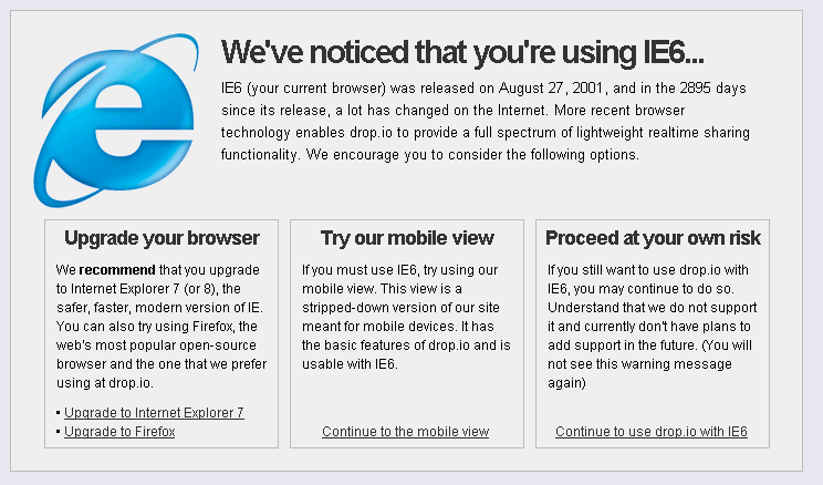
Many of the sites I need to look at don’t even work on IE6 anymore. The other day I browsed to drop.io from work and got the following message:

drop.io IE6 message
drop.io IE6 message (click to enlarge)

Embarrassing right?

So, here is my recommendation to all companies:

At all times allow your employees the freedom to use the technology they want

Yes, this means that you cannot standardise on hardware and software.

Yes, this means you have to allow access to your network from the device that your employee chooses.

Yes, this means you will have to support open standards so that people with a Mac or running Linux can access your applications.

Yes, you will need more bandwidth because you will have to allow YouTube and Facebook.

Yes, you will have extra costs because of all this.

But these extra costs will easily be offset by the extra productivity that your employees can deliver for you. In a couple of years it might actually become difficult to find employees that want to work for your company if you don’t heed to this recommendation.

Is your productivity affected by your workspace? Does your company allow you to choose your hardware? Can you install the software that you want and/or need? I look forward to any comments.

Did You Know Moodle 2.0 Will….? (Online Educa 2009)

Martin Dougiamas spoke about Moodle 2.0 at the 2009 Online Educa in Berlin
Martin Dougiamas spoke about Moodle 2.0 at the 2009 Online Educa in Berlin. Photograph by David Ausserhofer and licensed under a Creative Commons Attribution 2.0 Germany License.

I have written about Moodle 2.0 before. But last week in Berlin I had the opportunity to attend two more presentations by Martin Dougiamas about the plans for the next major version of Moodle and I have gotten a better idea of how things will work.

Moodle.com is completely transparent about their plans. You can read the roadmap and view the latest version of the planning document at any time. 16 developers are in Prague right now, making sure all of this will actually happen (search for #moodledev09 on Twitter).

My overview below is not complete. It is just some of the things I thought were interesting. Here we go! Did you know Moodle 2.0 will…

  • …look much better. The way that themes work will change completely. This will allow for much more flexible templating and theming. Moodle has Patrick Malley as the theme coordinator. He has been commissioned to create 20 beautiful themes that will ship with Moodle 2.0. Moodle will not ship with any of the old themes. The old icons will be replaced with a new set based on the Tango guidelines. All of this is great news as most Moodle sites do use the default themes (see this 12.6MB image of registered Dutch Moodle sites for examples).
  • …break most things. The 2.0 release is seen as the chance to do things differently. A lot of code will be refactored. There will be a smooth upgrade from 1.9 to 2.0 for the core code, but any customisations and extra modules will more than likely need an update. Examples? Every designed theme will need to be updated, 1.9 backups will probably not restore in 2.0 (update: there is a workaround) and old ways of getting files into the system (FTP anyone?) will not work anymore.
  • …allow you to search for Flickr images with a particular Creative Commons licence and will add the license to the image itself. This is one of my pet favourites, because it shows how anyone who is willing to be part of the dialogue around Moodle development (regardless of whether they are a developer or not) can influence the feature set of Moodle. I created a request for this feature in the Moodle Tracker and Martin demoed it in both his presentations in Berlin. We still need to get the user interface right, but the functionality is there.
  • …have the concept of a finished course. In current versions of Moodle there is no way to let the system know that a particular learner has finished the course. The concept just doesn’t exist. A lot of people require this functionality. It could be used as a trigger for sending the course grade to some other system, or could trigger the creation of a certificate.
  • …allow for conditional activities. In 2.0 you can make the availability of activities and resources for a particular learner dependent on certain conditions. These conditions could be the completion status of a particular activity (what completed means depends on the type of activity) or a grade for a particular activity. Finally it will be possible to set up your course in advance and then let it run by itself! No facilitation required! If Skinner is still your educational philosopher of choice, you will be very happy with this functionality! On a more serious note: this will allow for even more flexible Moodle course setups and that is never a bad thing.
  • …import external blogs. I believe blogging should be done on a platform that is as open as possible. This way your audience can be as large as possible and that means the interactions and dialogue around your blog will be at its most valuable. This is the reason why I don’t use the internal blogs that my employer provides me with and why I don’t have an active blog on Moodle.org or on any other Moodle installation. Not only will Moodle have a proper RSS feed for your internal blog, it will also allow you to import an external blog (based on a feed URL and on tags) and make it available internally. Moodle will make sure that the posts are in sync: so if you delete a post on your internal blog, it will also be removed from your internal blog. Brilliant!
  • …have a decent HTML editor that works in more than two browsers. HTML Area, the HTML editor that current versions of Moodle use, is old and crusty and does not work in many browsers. Moodle 2.0 will integrate TinyMCE, an HTML editor that has a larger and vibrant development community. It will work on Internet Explorer, Firefox, Safari, Opera and Chrome/Chromium. All Moodle users will really appreciate this change (even if they might not be aware of it).
  • …allow comments on everything. This is the pedagogical big winner for me. It is possible to add a comment block to nearly every resource/activity in Moodle 2.0. This will allow for a lot of peer feedback which can then be aggregated in different places (in the course, in a users profile?). I recently did a course on Rapid e-Learning Design where one of the core activities was commenting on other people’s work. The richness of interaction that this created was amazing. I am just hoping that the development team will think real hard about some of the user interface decisions around the comment API: that will make all the difference.
  • …have a workshop module that you are not scared of using. Currently the workshop module is broken. I would not recommend anybody to use it. The peer feedback concept that it embodies is not broken though! David Mudrák has completely rewritten the workshop module and the first comments are very positive.
  • …will have a built-in feedback/survey module. Modules that implement survey functionality in Moodle have always been the most popular add-ons. Andreas Grabs’ Feedback module will become part of the Moodle core code from 2.0 onwards.
  • …will not eat disk space if a file is used or uploaded multiple times. We all know the problem. You have a course that has a 300MB presentation in it. The course is duplicated for another run. Now you have two courses with 600MB of presentations. This problem is a thing of the past in Moodle 2.0. All information about files and where they are used is stored in the database (drastically improving the security around who can access a particular file). The files itself are stored on the filesystem. A SHA-1 check on each new file will make sure that identical files are not stored twice.
  • …have a completely new way of navigating. The way users navigate a Moodle installation has gotten a complete rewrite. Tim Hunt has done a very commendable job involving the community in his design plans and there is an excellent page in the Moodle Docs explaining what it is going to look like. It boils down to a more consistent navigation bar, a new Ajaxy navigation block which allows you to jump to any resource/activity in any of your courses in one step and the moving of many of the module related settings that were hovering at the top right corner of the page to the administration block.
  • …be a reinvention of itself as a platform. Moodle was approaching the end of its life cycle as a “Walled garden” product. Moodle was ahead of the game in 2001, but has been passed by many of the developments on the Internet since its inception. When Moodle was first conceptualised things like WordPress MU, Ning, Flickr, Delicious and Wikipedia did not exist. Moodle needed to reinvent itself. The repository and portfolio APIs in combination with the Web Services layer will allow Moodle to become much more a platform than an application. Moodle will keep its relevance or will become relevant again (depending on your viewpoint on the state of educational technology). I am already imagining the Moodle App Store.
  • …change the world of education (if nothing else). I think that Moodle already has had a very positive impact on the world of education, but if the Moodle Hubs scheme works, it will be a lot easier for teachers to share the share their best practices and collaborate with other teachers the world over.

I am certainly looking forward to its release! Are you excited yet?