Reflecting on Lift France 2011: Key Themes

A couple of weeks ago I attended the Lift France 2011 conference. For me this was different than my usual conference experience. I have written before how Anglo-Saxon my perspective is, so to be at a conference where the majority of the audience is French was refreshing.

Although there was a track about learning, most of the conference approached the effects of digital technology on society from angles that were relatively new to me. In a pure learning conference, I am usually able to contextualize what I see immediately and do some real time reflecting. This time I had to stick to reporting on what I saw (all my #lift11 posts are listed here) and was forced to take a few days and reflect on what I had seen.

Below, in random order, an overview of what I would consider to be the big themes of the conference. Occasionally I will try to speculate on what these themes might mean for learning and for innovation.

Utilization of excess capacity empowered by collaborative platforms

Robin Chase gave the clearest explanation of this theme that many speakers kept referring back to:

Economic Logic of Using Access Capacity by Robin Chase

This world has large amounts of excess capacity that isn’t used. In the past, the transaction costs of sharing (or renting out) this capacity was too high to make it worthwhile. The Internet has facilitated the creation of collaborative platforms that lower these transaction costs and make trust explicit. Chase’s most simple example is the couch surfing idea and her Zipcar and Buzzcar businesses are examples of this too.

Entangled with the idea of sharing capacity is the idea of access being more important than ownership. This will likely come with a change in the models for consumption: from owning a product to consuming a service. The importance of access shows why it is important to pay attention to the (legal) battles being fought on patents, copyrights, trademarks and licenses.

I had some good discussions with colleagues about this topic. Many facilities, like desks in offices, are underused and it would be good to try and find ways of getting the percentage of utilization up. One problem we saw is how to deal with peak demand. Rick Marriner made the valid suggestion that transparency about the demand (e.g. knowing how many cars are booked in the near future) will actually feed back into the demand and thus flatten the peaks.

A quick question that any (part of an) organization should ask itself is which assets and resources have excess capacity because in the past transaction costs for sharing them across the organization were too high. Would it now be possible to create platforms that allow the use of this extra capacity?

Another question to which I currently do not have an answer is whether we can translate this story to cognitive capacity. Do we have excess cognitive capacity and would there be a way of sharing this? Shirky’s Cognitive Surplus and the Wikipedia project seem to suggest we do. Can organizations capture this value?

Disintermediation

The idea of the Internet getting rid of intermediaries is very much related to the point above. Intermediaries were a big part of the transaction costs and they are disappearing everywhere. Travel agents are the canonical example, but at the conference, Paul Wicks talked about PatientsLikeMe, a site that partially tries to disintermediate doctors out of the patient-medicine relationship.

What candidates for disintermediation exist in learning? Is the Learning Management System the intermediary or the disintermediator? I think the former. What about the learning function itself? In the last years I have seen a shift where the learning function is moving away from designing learning programs into becoming a curator of content and service providers and a manager of logistics. These are exactly the type of activities that are not needed anymore in the networked world. Is this why the learning profession is in crisis? I certainly think so.

The primacy (and urgency) of design

Maybe it was the fact that the conference was full of French designeurs (with the characteristic Philippe Starck-ish eccentricities that I enjoy so much), but it really did put the urgency of design to the forefront once again for me. I would argue that design means you think about the effects that you would like to have in this world. As a creator it is your responsibility to think deeply and holistically. I will not say that you can always know the results of your design (product, service, building, city, organization, etc.), there will be externalities, but it is important that you leave nothing to chance (accident) or to convenience (laziness).

There is a wealth of productivity to be gained here. I am bombarded by bad (non-)design every single day. Large corporations are the worst offenders. The only design parameter that seems to be relevant for processes is whether they reduce risk enough, not whether they are usable for somebody trying to get something done. Most templates focus on completeness and not on aesthetics or ease of use. When last did you receive a PowerPoint deck that wasn’t full of superfluous elements that the author couldn’t be bothered to remove?

Ivo Wenzler reminded me of Checkhov’s gun (no unnecessary elements in a story). What percentage of the learning events that you have attended in the last couple of years adhered to this?

We can’t afford not to design. The company I work for is full of brilliant engineers. Where are the brilliant designers?

Distributed, federated and networked systems

Robin Chase used the image below and explicitly said that we now finally realize that distributed networks are the right model to overcome the problems of centralized and decentralized systems.

From "On Distributed Communication Networks", Baran, 1962

I have to admit that the distinction between decentralized and distributed eludes me for now (I guess I should read Baran’s paper), but I did notice at Fosdem earlier this year that the open source world is urgently trying to create alternatives to big centralized services like Twitter and Facebook. Moglen talked about the Freedombox as a small local computer that would do all the tasks that the cloud would normally do, there is StatusNet, unhosted and even talk of distributed redundant file systems and wireless mesh networking.

Can large organizations learn from this? I always see a tension between the need for central governance, standardization and uniformity on the one hand and the local and specific requirements on the other hand. More and more systems are now designed to allow for central governance and the advantages of interoperability and integration, while at the same time providing configurability away from the center. Call it organized customization or maybe even federation. I truly believe you should think deeply about this whenever you are implementing (or designing!) large scale information systems.

Blurring the distinction between the real and the virtual worlds

Lift also had an exhibitors section titled “the lift experience“, mostly a place for multimedia art (imagine a goldfish in a bowl sat atop an electric wheelchair, a camera captured the direction the fish swam in and the wheelchair would then move in the same direction). There were quite a few projects using the Arduino and even more that used “hacked” Kinects to enable new types of interaction languages.

Photo by Rick Marriner

Most projects tried, in some way, to negotiate a new way of working between the virtual and the real (or should I call it the visceral). As soon as those boundaries disappear designers will have an increased ability to shape reality. One of the projects that I engaged with the most was the UrbanMusicalGame: a set of gyroscopes and accelerometers hidden in soft balls. By playing with these balls you could make beautiful music while using an iPhone app to change the settings (unfortunately the algorithms were not yet optimized for my juggling). This type of project is the vanguard of what we will see in the near term.

Discomfort with the dehumanizing aspects of technology

A surprising theme for me was the well articulated discomfort with the dehumanizing aspects of some of the emerging digital technologies. As Benkler says: technology creates feasibility spaces for social practice and not all practices that are becoming feasible now have positive societal impact.

One artist, Emmanuel Germond, seemed to be very much in touch with these feeling. His project, Exposition au Danger Psychologique, made fun of people’s inability to deal with all this information and provided some coy solutions. Alex Peng talked about contemplative computing, Chris de Decker showed examples of low-tech solutions from the past that can help solve our current problems and projects in the Lift Experience showed things like analog wooden interfaces for manipulating digital music.

This leads me to believe that both physical reality and being disconnected will come at a premium in the near future. People will be willing to pay for having real experiences versus the ubiquitous virtual experiences. Not being connected to the virtual world will become more expensive as it becomes more difficult. Imagine a retreat which markets itself as having no wifi and a giving you a free physical newspaper in the morning (places like this are starting to pop up, see this unplugged conference or this reporter’s unconnected weekend).

There will be consequences for Learning and HR at large. For the last couple of years we have been moving more and more of our learning interventions into the virtual space. Companies have set up virtual universities with virtual classrooms, thousands and thousands of hours of e-learning are produced every year and the virtual worlds that are used in serious games are getting more like reality every month.

Thinking about the premium of reality it is then only logical that allowing your staff to connect with each other in the real world and collaborate in face to face meetings will be a differentiator for acquiring and retaining talent.

Big data for innovation

I’ve done a lot of thinking about big data this year (see for example these learning analytics posts) and this was a tangential topic at the conference. The clearest example came from a carpool site which can use it’s data about future reservation to clearly predict how busy traffic will be on a particular day. PatientsLikeMe is of course another example of a company that uses data as a valuable asset.

Supercrunchers is full of examples of data-driven solutions to business problems. The ease of capturing data, combined with the increase in computing power and data storage has made doing randomized trials and regression analysis feasible where before it was impossible.

This means that the following question is now relevant for any business: How can we use the data that we capture to make our products, services and processes better? Any answers?

The need to overcome the open/closed dichotomy

In my circles, I usually only encounter people who believe that most things should be open. Geoff Mulgan spoke of ways to synthesize the open/closed dichotomy. I am not completely sure how he foresees doing this, but I do know that both sides have a lot to learn from each other.

Disruptive software innovations currently don’t seem to happen int the open source world, but open source does manage to innovate when it comes to their own processes. They manage to scale projects to thousands of participants, have figured out ways of pragmatically dealing with issues of intellectual property (in a way that doesn’t inhibit development) and have created their own tool sets to make them successful at working in dispersed teams (Git being my favorite example).

When we want to change the way we do innovation in a networked world, then we shouldn’t look at the open source world for the content of innovation or the thought leadership, instead we should look at their process.

Your thoughts

A lot of the above is still very immature and incoherent thinking. I would therefore love to have a dialog with anybody who could help me deepen my thoughts on these topics.

Finally, to give a quick flavour of all my other posts about Lift 11, the following word cloud based on those posts:

Lift11 Word Cloud
My Lift 11 wordcloud, made with Wordle

Lak11 Week 3 and 4 (and 5): Semantic Web, Tools and Corporate Use of Analytics

Two weeks ago I visited Learning Technologies 2011 in London (blog post forthcoming). This meant I had less time to write down some thoughts on Lak11. I did manage to read most of the reading materials from the syllabus and did some experimenting with the different tools that are out there. Here are my reflections on week 3 and 4 (and a little bit of 5) of the course.

The Semantic Web and Linked Data

This was the main topic of week three of the course. Basically the semantic web has a couple of characteristics. It tries to separate the presentation of the data and the data itself. It does this by structuring the data which then allows linking up all the data. The technical way that this is done is through so-called RDF-triples: a subject, a predicate and an object.

Although he is a better writer than speaker, I still enjoyed this video of Tim Berners-Lee (the inventor of the web) explaining the concept of linked data. His point about the fact that we cannot predict what we are going to make with this technology is well taken: “If we end up only building the things I can imagine, we would have failed“.

[youtube=http://www.youtube.com/watch?v=OM6XIICm_qo]

The benefits of this are easy to see. In the forums there was a lot of discussion around whether the semantic web is feasible and whether it is actually necessary to put effort into it. People seemed to think that putting in a lot of human effort to make something easier to read for machines is turning the world upside down. I actually don’t think that is strictly true. I don’t believe we need strict ontologies, but I do think we could define more simple machine readable formats and create great interfaces for inputting data into these formats.

Use cases for analytics in corporate learning

Weeks ago Bert De Coutere started creating a set of use cases for analytics in corporate learning. I have been wanting to add some of my own ideas, but wasn’t able to create enough “thinking time” earlier. This week I finally managed to take part in the discussion. Thinking about the problem I noticed that I often found it difficult to make a distinction between learning and improving performance. In the end I decided not to worry about it. I also did not stick to the format: it should be pretty obvious what kind of analytics could deliver these use cases. These are the ideas that I added:

  • Portfolio management through monitoring search terms
    You are responsible for the project management portfolio learning portfolio. In the past you mostly worried about “closing skill gaps” through making sure there were enough courses on the topic. In recent years you have switched to making sure the community is healthy and you have switched from developing “just in case” learning intervention towards “just in time” learning interventions. One thing that really helps you in doing your work is the weekly trending questions/topics/problems list you get in your mailbox. It is an ever-changing list of things that have been discussed and searched for recently in the project management space. It wasn’t until you saw this dashboard that you noticed a sharp increase in demand for information about privacy laws in China. Because of it you were able to create a document with some relevant links that you now show as a recommended result when people search for privacy and China.
  • Social Contextualization of Content
    Whenever you look at any piece of content in your company (e.g. a video on the internal YouTube, an office document from a SharePoint site or news article on the intranet), you will not only see the content itself, but you will also see which other people in the company have seen that content, what tags they gave it, which passages they highlighted or annotated and what rating they gave the piece of content. There are easy ways for you to manage which “social context” you want to see. You can limit it to the people in your direct team, in your personal network or to the experts (either as defined by you or by an algorithm). You love the “aggregated highlights view” where you can see a heat map overlay of the important passages of a document. Another great feature is how you can play back chronologically who looked at each URL (seeing how it spread through the organization).
  • Data enabled meetings
    Just before you go into a meeting you open the invite. Below the title of the meeting and the location you see the list of participants of the meeting. Next to each participant you see which other people in your network they have met with before and which people in your network they have emailed with and how recent those engagements have been. This gives you more context for the meeting. You don’t have to ask the vendor anymore whether your company is already using their product in some other part of the business. The list also jogs your memory: often you vaguely remember speaking to somebody but cannot seem to remember when you spoke and what you spoke about. This tools also gives you easy access to notes on and recordings of past conversations.
  • Automatic “getting-to-know-yous”
    About once a week you get an invite created by “The Connector”. It invites you to get to know a person that you haven’t met before and always picks a convenient time to do it. Each time you and the other invitee accept one of these invites you are both surprised that you have never met before as you operate with similar stakeholders, work in similar topics or have similar challenges. In your settings you have given your preference for face to face meetings, so “The Connector” does not bother you with those video-conferencing sessions that other people seem to like so much.
  • “Train me now!”
    You are in the lobby of the head office waiting for your appointment to arrive. She has just texted you that she will be 10 minutes late as she has been delayed by the traffic. You open the “Train me now!” app and tell it you have 8 minutes to spare. The app looks at the required training that is coming up for you, at the expiration dates of your certificates and at your current projects and interests. It also looks at the most popular pieces of learning content in the company and checks to see if any of your peers have recommended something to you (actually it also sees if they have recommended it to somebody else, because the algorithm has learned that this is a useful signal too), it eliminates anything that is longer than 8 minutes, anything that you have looked at before (and haven’t marked as something that could be shown again to you) and anything from a content provider that is on your blacklist. This all happens in a fraction of a second after which it presents you with a shortlist of videos for you to watch. The fact that you chose the second pick instead of the first is of course something that will get fed back into the system to make an even better recommendation next time.
  • Using micro formats for CVs
    The way that a simple structured data format has been used to capture all CVs in the central HR management system in combination with the API that was put on top of it has allowed a wealth of applications for this structured data.

There are three more titles that I wanted to do, but did not have the chance to do yet.

  • Using external information inside the company
  • Suggested learning groups to self-organize
  • Linking performance data to learning excellence

Book: Head First Data Analytics

I have always been intrigued by O’Reilly’s Head First series of books. I don’t know any other publisher who is that explicit about how their books try to implement research based good practices like an informal style, repetition and the use of visuals. So when I encountered Data Analysis in the series I decided to give it a go. I wrote the following review on Goodreads:

The “Head First” series has a refreshing ambition: to create books that help people learn. They try to do this by following a set of evidence-based learning principles. Things like repetition, visual information and practice are all incorporated into the book. This good introduction to data analysis, in the end only scratches the surface and was a bit too simplistic for my taste. I liked the refreshers around hypothesis testing, solver optimisation in Excel, simple linear regression, cleaning up data and visualisation. The best thing about the book is how it introduced me to the open source multi-platform statistical package “R”.

Learning impact measurement and Knowledge Advisers

The day before Learning Technologies, Bersin and KnowledgeAdvisors organized a seminar about measuring the impact of learning. David Mallon, analyst at Bersin, presented their High-Impact Measurement framework.

Bersin High-Impact Measurement Framework

The thing that I thought was interesting was how the maturity of your measurement strategy is basically a function of how much your learning organization has moved towards performance consulting. How can you measure business impact if your planning and gap analysis isn’t close to the business?

Jeffrey Berk from KnowledgeAdvisors then tried to show how their Metrics that Matter product allows measurement and then dashboarding around all the parts of the Bersin framework. They basically do this by asking participants to fill in surveys after they have attended any kind of learning event. Their name for these surveys is “smart sheets” (an much improved iteration of the familiar “happy sheets”). KnowledgeAdvisors has a complete software as a service based infrastructure for sending out these digital surveys and collating the results. Because they have all this data they can benchmark your scores against yourself or against their other customers (in aggregate of course). They have done all the sensible statistics for you, so you don’t have to filter out the bias on self-reporting or think about cultural differences in the way people respond to these surveys. Another thing you can do is pull in real business data (think things like sales volumes). By doing some fancy regression analysis it is then possible to see what part of the improvement can be attributed with some level of confidence to the learning intervention, allowing you to calculate return on investment (ROI) for the learning programs.

All in all I was quite impressed with the toolset that they can provide and I do think they will probably serve a genuine need for many businesses.

The best question of the day came from Charles Jennings who pointed out to David Mallon that his talk had referred to the increasing importance of learning on the job and informal learning, but that the learning measurement framework only addresses measurement strategies for top-down and formal learning. Why was that the case? Unfortunately I cannot remember Mallon’s answer (which probably does say something about the quality or relevance of it!)

Experimenting with Needlebase, R, Google charts, Gephi and ManyEyes

The first tool that I tried out this week was Needlebase. This tool allows you to create a data model by defining the nodes in the model and their relations. Then you can train it on a web page of your choice to teach it how to scrape the information from the page. Once you have done that Needlebase will go out to collect all the information and will display it in a way that allows you to sort and graph the information. Watch this video to get a better idea of how this works:

[youtube=http://www.youtube.com/watch?v=58Gzlq4zSDk]

I decided to see if I could use Needlebase to get some insights into resources on Delicious that are tagged with the “lak11” tag. Once you understands how it works, it only takes about 10 minutes to create the model and start scraping the page.

I wanted to get answers to the following questions:

  • Which five users have added the most links and what is the distribution of links over users?
  • Which twenty links were added the most with a “lak11” tag?
  • Which twenty links with a “lak11” tag are the most popular on Delicious?
  • Can the tags be put into a tag cloud based on the frequency of their use?
  • In which week were the Delicious users the most active when it came to bookmarking “lak11” resources?
  • Imagine that the answers to the questions above would be all somebody were able to see about this Knowledge and Learning Analytics course. Would they get a relatively balanced idea about the key topics, resources and people related to the course? What are some of the key things that would they would miss?

Unfortunately after I had done all the machine learning (and had written the above) I learned that Delicious explicitly blocks Needlebase from accessing the site. I therefore had to switch plans.

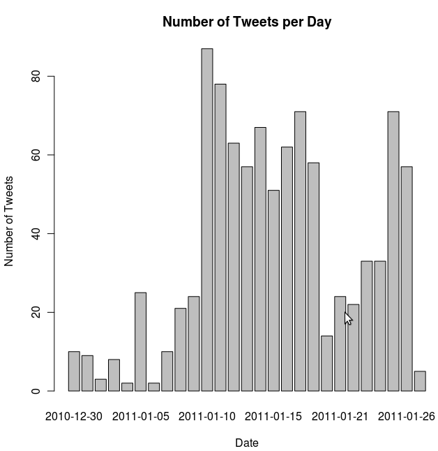
The Twapperkeeper service keeps a copy of all the tweets with a particular tag (Twitter itself only gives access to the last two weeks of messages through its search interface). I manage to train Needlebase to scrape all the tweets, the username, URL to user picture and userid of the person adding the tweet, who the tweet was a reply to, the unique ID of the tweet, the longitude and latitude, the client that was used and the date of the tweet.

I had to change my questions too:

Another great resource that I re-encountered in these weeks of the course was the Rosling’s Gapminder project:

[youtube=http://www.youtube.com/watch?v=BPt8ElTQMIg]

Google has acquired some part of that technology and thus allows a similar kind of visualization with their spreadsheet data. What makes the data smart is the way that it shows three variables (x-axis, y-axis and size of the bubble and how they change over time. I thought hard about how I could use the Twitter data in this way, but couldn’t find anything sensible. I still wanted to play with the visualization. So at the World Bank’s Open Data Initiative I could download data about population size, investment in education and unemployment figures for a set of countries per year (they have a nice iPhone app too). When I loaded that data I got the following result:

Click to be able to play the motion graph

The last tool I installed and took a look at was Gephi. I first used SNAPP on the forums of week and exported that data into an XML based format. I then loaded that in Gephi and could play around a bit:

Week 1 forum relations in Gephi

My participation in numbers

I will have to add up my participation for the two (to three) weeks, so in week 3 and week 4 of the course I did 6 Moodle posts, tweeted 3 times about Lak11, wrote 1 blogpost and saved 49 bookmarks to Diigo.

The hours that I have played with all the different tools mentioned above are not mentioned in my self-measurement. However, I did really enjoy playing with these tools and learned a lot of new things.

Lak11 Week 2: Rise of “Big Data” and Data Scientists

These are my reflection and thoughts on the second week of Learning and Knowledge analytics (Lak11). These notes are first an foremost to cement my own learning experience, so for everybody but me they might feel a bit disjointed.

What was week 2 about?

This week was an introduction to the topic of “big data”. As a result of all the exponential laws in computing, the amount of data that gets generated every single day is growing massively. New methods of dealing with the data deluge have cropped up in computer science.  Businesses, governments and scientists are learning how to use the data that is available to their advantage. Some people actually think this will fundamentally change our scientific method (like Chris Anderson in Wired).

Big data: Hadoop

Hadoop is one of these things that I heard a lot about without ever really understanding what it was. This Scoble interview with the CEO of Cloudera made things a lot clearer for me.

[youtube=http://www.youtube.com/watch?v=S9xnYBVqLws]

Here is the short version: Hadoop is a set of open source technologies (it is part of the Apache project) that allows anyone to do large scale distributed computing. The main parts of Hadoop are a distributed filesystem and a software framework for processing large data sets on clusters.

The technology is commoditised, imagination is what is needed now

The Hadoop story confirmed for me that this type of computing is already largely commoditised. The interesting problems in big data analytics are probably not technical anymore. What is needed isn’t more computing power, we need more imagination.

The MIT Sloan Management Review article titled Big Data, Analytics and the Path from Insights to Value says as much:

The adoption barriers that organizations face most are managerial and cultural rather than related to data and technology. The leading obstacle to wide-spread analytics adoption is lack of understanding of how to use analytics to improve the business, according to almost four of 10 respondents.

This means that we should start thinking much harder about what things we want to know that we couldn’t get before in a data-starved world. This means we have to start with the questions. From the same article:

Instead, organizations should start in what might seem like the middle of the pro-cess, implementing analytics by first defining the insights and questions needed to meet the big busi-ness objective and then identifying those pieces of data needed for answers.

I will therefore commit myself to try and formulate some questions that I would like to have answered. I think that Bert De Coutere’s use cases could be an interesting way of approaching this.

This BusinessWeek excerpt from Stephen Baker’s The Numerati gives some insight into where this direction will take us in the next couple of years. It profiles a mathematician at IBM, Haren, who is busy working on algorithms that help IBM match expertise to demand in real time, creating teams of people that would maximise profits. In the example, one of the deep experts takes a ten minute call while being on the skiing slopes. By doing that he:

[..] assumes his place in what Haren calls a virtual assembly line. “This is the equivalent of the industrial revolution for white-collar workers,”

Something to look forward to?

Data scientists, what skills are necessary?

This new way of working requires a new skill set. There was some discussion on this topic in the Moodle forums. I liked Drew Conway’s simple perspective, basically a data scientist needs to be on the intersection of Math & Statistics Knowledge, Substantive Expertise and Hacking Skills. I think that captures it quite well.

Data Science Venn Diagram (by Drew Conway)

How many people do you know who could occupy that space? The How do I become a data scientist? question on Quora also has some very extensive answers as well.

Connecting connectivism with learning analytics

This week the third edition of the Connectivism and Connective Knowledge course has started too. George Siemens kicked of by posting a Connectivism Glossary.

It struck me that many of the terms that he used there are things that are easily quantifiable with Learning Analytics. Concepts like Amplification, Resonance, Synchronization, Information Diffusion and Influence are all things that could be turned into metrics for assessing the “knowledge health” of an organisation. Would it be an idea to get clearer and more common definitions of these metrics for use in an educational context?

Worries/concerns from the perspective of what technology wants

Probably the most lively discussion in the Moodle forums was around critiques of learning analytics. My main concern for analytics is the kind of feedback loop it introduces once you become public with the analytics. I expressed this in a reference to Goodhart’s law which states that:

Any observed statistical regularity will tend to collapse once pressure is placed upon it for control purposes

George Siemens did a very good job in writing down the main concerns here. I will quote them in full for my future easy reference.

1. It reduces complexity down to numbers, thereby changing what we’re trying to understand
2. It sets the stage for the measurement becoming the target (standardized testing is a great example)
3. The uniqueness of being human (qualia, art, emotions) will be ignored as the focus turns to numbers. As Gombrich states in “The Story of Art”: The trouble about beauty is that tastes and standards of what is beautiful vary so much”. Even here, we can’t get away from this notion of weighting/valuing/defining/setting standards.
4. We’ll misjudge the balance between what computers do best…and what people do best (I’ve been harping for several years about this distinction as well as for understanding sensemaking through social and technological means).
5. Analytics can be gamed. And they will be.
6. Analytics favour concreteness over accepting ambiguity. Some questions dont have answers yet.
7. The number/quantitative bias is not capable of anticipating all events (black swans) or even accurately mapping to reality (Long Term Capital Management is a good example of “when quants fail”: http://en.wikipedia.org/wiki/Long-Term_Capital_Management )
8. Analytics serve administrators in organizations well and will influence the type of work that is done by faculty/employees (see this rather disturbing article of the KPI influence in universities in UK: http://www.nybooks.com/articles/archives/2011/jan/13/grim-threat-british-universities/?page=1 )
9. Analytics risk commoditizing learners and faculty – see the discussion on Texas A & M’s use of analytics to quantify faculty economic contributions to the institution: http://www.nybooks.com/articles/archives/2011/jan/13/grim-threat-british-universities/?page=2 ).
10. Ethics and privacy are significant issues. How can we address the value of analytics for individuals and organizations…and the inevitability that some uses of analytics will be borderline unethical?

This type of criticism could be enough for anybody to give up already and turn their back to this field of science. I personally belief that this would a grave mistake. You would be moving against the strong and steady direction of technology’s tendencies.

SNAPP: Social network analysis

The assignment of the week was to take a look at Social Networks Adapting Pedagogical Practice (better known as SNAPP) and use it on the Moodle forums of the course. Since I had already played with it before I only looked at Dave Cormier‘s video of his experience with the tool:

[youtube=http://www.youtube.com/watch?v=ZHNM8FWrpLk]

Snapp’s website gives a good overview of some of the things that a tool like this can be used for. Think about finding disconnected or at-risk students, seeing who are the key information brokers in the class, use it for “before and after” snapshots of a particular intervention, etc.

Before I was able to use it inside my organisation I needed to make sure that the tool does not send any of the data it scrapes back home to the creators of the software (why wouldn’t it, it is a research project after all). I had an exchange with Lori Lockyer, professor at Wollongong, who assured me that:

SNAPP locally complies the data in your Moodle discussion forum but it does not send data from the server (where the discussion forum is hosted) to the local machine nor does it send data from the local machine to the server.

Making social networks inside applications (and ultimately inside organisations) more visible to many more people using standard interfaces is a nice future to look forward to. Which LMS is the first to have these types of graphs next to their forum posts? Which LMS will export graphs in some standard format for further processing with tools like Gephi?

Gephi is one of the tools by the way, that I really should start to experiment with sooner rather than later.

The intelligent spammability of open online courses: where are the vendors?

One thing that I have been thinking about in relation to these Open Online Courses is how easy it would be for vendors of particular related software products to come and crash the party. The open nature of these courses lends itself to spam I would say.

Doing this in an obnoxious way will ultimately not help you with this critical crowd, but being part of the conversation (Cluetrain anybody?) could be hugely beneficial from a commercial point of view. As a marketeer where else would you find as many people deeply interested into Learning Analytics as in this course? Will these people not be the influencers in this space in the near future?

So where are the vendors? Do you think they are lurking, or am I overstating the opportunity that lies here for them?

My participation in numbers

Every week I give a numerical update about my course participation (I do this in the spirit of the quantified self, as a motivator and because it seems fitting for the topic). This week I bookmarked 37 items on Diigo, wrote 3 Lak11 related tweets, wrote 5 Moodle forum posts and 1 blog post.

Lak11 Week 1: Introduction to Learning and Knowledge Analytics

Every week I will try and write down some reflections on the Open Online Course: Learning and Knowledge Analytics. These will by written for myself as much as for anybody else, so I have to apologise in advance about the fact that there will be nearly no narrative and a mix between thoughts on the contents of the course and on the process of the course.

So what do I have to write about this week?

My tooling for the course

There is a lot of stuff happening in these distributed courses and keeping up with the course required some setup and preparation on my side (I like to call that my “tooling”). So what tools do I use?

A lot of new materials to read are created every day: Tweets with the #lak11 hashtag, posts in all the different Moodle forums, Google groups and Learninganalytics.net messages from George Siemens and Diigo/Delicious bookmarks. Thankfully all of these information resources create RSS feeds and I have been able to add them all to special-made Lak11 folder in my Google Reader (RSS feed). That folder sorts its messages based on time (oldest first) allowing me some understanding of the temporal aspects of the course and making sure I read a reply after the original message. A couple of times a day I use the excellent MobileRSS reader on my iPad to read through all the messages.

There is quite a lot of reading to do. At the beginning of the week I read through the syllabus and make sure that I download all the PDF files to GoodReader on the iPad. All web articles are stored for later reading using the Instapaper service. I have given both GoodReader and Instapaper Lak11 folders. I do most of the reading of these articles on the train. GoodReader allows me to highlight passages and store bookmarks in the PDF file itself. With Instapaper thus is a bit more difficult: when I read a very interesting paragraph I have to highlight it and email it to myself for later processing.

Each and every resource that I touch for the course gets its own bookmark on Diigo. Next to the relevant tags for the resource I also tag them with lak11 and weekx (where x is the number of the week) and share them to the Learning Analytics group on Diigo. These will provide me with a history of the interesting things I have seen during the course and should help me in writing a weekly reflective post.

So far the “consumer” side of things. As a “producer” I participate in the Moodle forums. I can easily find back all my own posts through my Moodle profile and I hope to use some form of screen-scraper at the end of the course to pull a copy of everything that I have written. I use this Worpress.com hosted blog to write and reflect on the course materials and tag my course-related post with “lak11” so that show up on their own page (and have their own feed in case you are interested). On Twitter I occasionally tweet with #lak11, mostly to refer to a Moodle- or blog post that I have written or to try and ask the group a direct question.

What is missing? The one thing that I don’t use yet is something like a mind mapping or a concept mapping tool. The syllabus recommends VUE and CMAP and one of the assignments each week is to keep updating a map for the course. These tools don’t seem to have an iPad equivalent. There is some good mind mapping tools for the iPad (my favourite is probably iThoughtsHD, watch this space for a mind mapping comparison of iPad apps), but I don’t seem to be able to add using it into my workflow for the course. Maybe I should just try a little harder.

My inability to “skim and dive”

This week I reconfirmed my inability to “skim and dive”. For these things I seem to be an all or nothing guy. There are magazines that I read completely from the first page to the last page (e.g. Wired). This course seems to be one of these things too. I read every single thing. It is a bit much currently, but I expect the volume of Moodle and Twitter messages to go down quite significantly as the course progresses. So if I can just about manage now, it should become relatively easy later on.

The readings of this week

There were quite a few academic papers in the readings of this week. Most of them provided an overview of education datamining or academic/learning analytics. Many of the discussions in these papers seemed quite nominal to me. They probably are good references to keep and have a wealth of bibliographical materials that I could look at at some point in the future. For now, they lacked any true new insights for me and appeared to be pretty basic.

Live sessions

Unfortunately I wasn’t able to attend any of the Elluminate sessions and I haven’t listened to them yet either. I hope to catch up this week with the recordings and maybe even attend the guest speaker live tomorrow evening.

Marginalia

It has been a while since I last actively participated in a Moodle facilitated course. Moodle has again proven to be a very effective host for forum based discussions. One interesting Moodle add-on that I had not seen before is Marginalia a way to annotate forum posts in Moodle itself which can be private or public. Look at the following Youtube video to see it in action.

[blip.tv ?posts_id=4054581&dest=-1]

I wonder if I will use it extensively in the next few weeks.

Hunch

One thing that we were asked to try out as an activity was Hunch. For me it was interesting to see all the different interpretations that people in the course had about how to pick up this task and what the question (What are the educational uses of a Hunch-like tool for learning?) actually meant. A distributed course like this creates a lot of redundancy in the answers. I also noted that people kept repeating a falsehood (needing to use Twitter/Facebook to log in). My explanation of how Hunch could be used by the weary was not really picked up. It is good to be reminded at times that most people in the world do not share my perspective on computers and my literacy with the medium. Thinking otherwise is a hard to escape consequence of living in a techno-bubble with the other “digerati”.

I wrote the following on the topic (in the Moodle forum for week 1):

Indeed the complete US-centricness of the service was the first thing that I noticed. I believe it asked me at some point on what continent I am living. How come it still asks me questions to which I would never have an answer? Are these questions crowdsourced too? Do we get them randomly or do we get certain questions based on our answers? It feels like the former to me.

The recommendations that it gave me seemed to be pretty random too. The occasional hit and then a lot of misses. I had the ambition to try out the top 5 music albums it would recommend me, but couldn’t bear the thought of listening to all that rock. This did sneak a little thought into my head: could it be that I am very special? Am I so eclectic that I can defeat all data mining effort. Am I the Napoleon Dynamite of people? Of course I am not, but the question remains: does this work better for some people than for others.

One other thing that I noticed how the site seemed to use some of the tricks of an astrologer: who wouldn’t like “Insalata Caprese”, seems like a safe recommendation to me.

In the learning domain I could see an application as an Electronic Performance Support System. It would know what I need in my work and could recommend the right website to order business cards (when it sees I go to a conference) or an interesting resource relating to the work that I am doing. Kind of like a new version of Clippy, but one that works.

BTW, In an earlier blogpost I have written about how recommendation systems could turn us all into mussels (although I don’t really believe that).

Corporate represent!

Because of a very good intervention by George Siemens, the main facilitator of the course, we are now starting to have a good discussion about analytics in corporate situations here. The corporate world has learning as a secondary process (very much as a means to a goal) and that creates a slightly different viewpoint. I assume the corporate people will form their own subgroup in some way in this course. Before the end of next week I will attempt to flesh out some more use cases following Bert De Coutere’s examples here.

Bersin/KnowledgeAdvisors Lunch and Learn

At the end of January I will be attending a free Bersin/KnowledgeAdvisors lunch and learn titled Innovation in Learning Measurement – High Impact Measurement Framework in London (this is one day before the Learning Technologies 2011 exhibit/conference). I would love to meet other Lak11 participants there. Will that happen?

My participation in numbers

Every week I will try and give a numerical update about my course participation. This week I bookmarked 33 items on Diigo, wrote 10 Lak11 related tweets, wrote 25 Moodle forums post and 2 blog posts.

Learning and Knowledge Analytics 2011: I Will Participate

Mining Social Networks (The Economist)
Mining Social Networks (The Economist/Andy J. Miller)

George Siemens has written about the upcoming Learning and Knowledge Analytics 2011 course (#lak11). After reading the very interesting draft syllabus I have decided to actively participate. This means you should be seeing reflections about the course in this very blog soon. The dedicated Moodle site for the course asks participants to introduce themselves and write about their course expectations. I have posted the following:

I am a 34 year old guy from Amsterdam in the Netherlands. I work as the “Innovation Manager for Global Learning Technologies” at Shell International (at the headquarters in The Hague). Before this job I was heavily involved with the Moodle project as an e-learning consultant working for the Dutch Moodle Partner (Stoas Learning). Before that I was a teacher at a high school in Amsterdam (I taught PE and project based education).

I love technology and am deeply interested in how it affects society. One of my business cards uses my favourite quote (from Yochai Benkler): “Technology creates feasibility spaces for social practice” (see here for more context). To me, this open course is an example too of a practice enabled by technological possibilities.

My blog can be found at http://blog.hansdezwart.info and you should also find links to my other social networking presences there. I try to blog regularly and what I write on this course is here.

I intend to actively participate in this course. For me this means:

  • Spending time to read and annotate all the course materials during my commute (1.5 hours each way) on my iPad.
  • Writing reflections at least once a week on my blog
  • Doing all the suggested activities and participate actively in the Moodle forums.
  • Try to attend the weekly live Elluminate sessions (if the timezone agrees with my schedule) or at least watch the recordings.

If I manage to the above, then the course will be a success for me. The topic is inherently fascinating to me and I would love to be helped with how learning and knowledge analytics could help my professional practice.

Looking forward to meeting other participants and learning together!

It would be great if some of my readers would also be able to join!