PICNIC Festival 2012 Day One

Today was the first day of the seventh edition of the PICNIC festival in Amsterdam (hashtag #picnic12. The festival’s goal is “to discover opportunities for transformation: processes, cultures, products, services, models and experiences”. The theme for the year is New Ownership: the shift from top down to bottom up. This is my first time attending the festival. I am on the lookout for interesting insights and connections around the topic of how to innovate at scale. Below some of my general notes and thoughts on the day.

George Dyson – There is Plenty of Room at the Top

Dyson‘s title is of course a reference to Feynman’s 1959 talk There’s Plenty of Room at the Bottom. He talked a bit about Feynman’s role at Los Alamos. The digital world we live in today is the result of a “deal with the devil”: if scientist would help the government get nuclear weapons then they would get the computers.

There is room at the bottom, but there is also room at the top: a development of a global intelligence through networked machines and computation at all levels. We are starting to make machines that can think, machines that can replicate themselves and evolve. The founders of the computing age already saw this coming and questioned what this would mean and where it would take us (e.g. Norbert Wiener in Cybernetics).

His whole talk was looking back at what people have said 50-100 years ago and how those statements translate to current times. I can see why the festival programmers decided to open with him, but his talk was all description and very little prescription which made it less than interesting for me.

Byron Reese – The Great Disconnect

Reese started talking about how it used to be that most of the basic elements of life where decided for you at birth. A lot of aspects of your life came from where you were born and in what type of family. These things did not change, there was very little mobility. Today, if there is something about your life you don’t like, you have the ability to change it: you are unthethered. Who you are is no longer a set of circumstances, instead it is a set of choices. There is self-determination. If we combine that with the freedom of conscience then we can have a set of beliefs that can actually underpin a nation.

These changes are driven by the enormous amounts of technological developments that are happening around us. He thinks we are on the cusp of eliminating poverty, hunger and disease by solving them as technological problems (this reminds me of the book Abundance I recently read). I guess Reese is a true techno-optimist (unfortunately without the sense to talk about how many people in the word aren’t “unthethered” yet). He beliefs that even though we are unthethered, we aren’t used to that yet and still behave as if we are thethered in many ways. His advice: “make the most of it”.

Rich Pell – Strategies in Genetic Copy-Protection

Pell is director of the Center for PostNatural History, basically a museum dedicated to living things that were altered by people.

PostNatural is an adjective defined as biological life that has been intentionally and heritably altered by humans. This usually requires human mediated and controlled production. This leads to ethical questions, mainly around the ownership of life. There are now patents on life forms (Pasteur actually had the first patent on a life form: on yeast for beer) and a few strategies for genetic copy prevention are emerging:

  • Security through obscurity: not giving any information about what your organism is or does.
  • Genetic control: built-in reproductive control in the genes, initially a way to make sure that it was possible to contain the genetically engineered organism.
  • Contractual agreement: a contract that prohibits breeding (standard in pure-bred lines for dogs for example).

Pell then showed Monsanto’s terms of agreement for farmers wanting to use their seeds. A legal text scrolled by for a long time of which the main point is that the seed is single-use and that the farmer doesn’t own the seed. You agree to the terms by opening the bag of seeds. Pell had to do some smart legal and physical “hacking” to be able to put Monsanto corn legally in their museum.

Dale Stephens – The Empowered Learner

Stephens didn’t enjoy school when he was twelve. He found a group of unschoolers and quit school with the reluctant permission of his parents.

Unschooling is a set of ideas that try to solve the current failings of education (cost are going up, while value of the education is going down (see here), no equality of opportunity, academic rigour disappearing). The term was coined by John Holt who wrote two books titled How Children Learn and How Children Fail. Holt was inspired by theSummerhill school (the school as a democratic community). Growing without schooling was a magazine that came out of this movement. I am surprised Stephens did not quote Illich’ Deschooling Society which will become a very important text in the next few years I believe (it is listed on the uncollege reading list I now see).

Unschooling is not the same as homeschooling. It isn’t isolating, Stephens learned in a group of 30 unschoolers who created their own learning experiences (“collaborative learning groups”). The basic idea is to trust people’s innate capacity to be curious.

When he didn’t go to college he was asked: “But what about beer and the girls?”. His standard answer to that question is now “I actually prefer guys and champagne”. Stephens has founded Uncollege (read the manifesto here) with the goal of decentralising education and has written the book Hacking Your Education through interviewing fifty people who have done something interesting with their lives without taking part in the traditional educational system.

Mike Lee- Macrometaengineering

Mike Lee talked about the creation of Appsterdam. Appsterdam is now 18 months old and Lee is the “mayor”. It is his attempt to create a tech ecosystem. In his talked he answered a few questions that I guess you could term macrometaengineering.

How do you attract entrepreneurs? You just have to better than the default (which Silicon Valley) and then you have to be easy to get to. One thing that is nice about Europe is the patent law. He quickly took a jab at patent law in the United States and how ridiculous it is to own ideas. Ideas come from zeitgeist, it is all about implementation.
How to create jobs? By making talented people and creating a technical labour surplus.
How to fund your company? It is incrediby easy to find money in the Netherlands. Check out le.mu.rs to see what he’ll be doing with his funding soon.
How to promote diversity? Very easy: stop discriminating and make sure that everybody is welcome.
How to open your data? How to keep your subsidies? How to resolve the crisis? Share the information with everyone in the world, please don’t care about borders.
How to build the future? Let’s figure it out if we are all fingers on the same hand. The future is ours to create.

I will have to take a closer look at Appsterdam as it seems like Lee has created a force for change out of nowhere.

Michael Schwarz – Re-Design for the Era of Sustainism

According to Schwarz we are in a new cultural era. To bring new culture into existence we first have to rename the world. So they came up with the word Sustainism (the new modernism: “less is more” is modernist, “do more with less” is sustainist) which is a lens to think about the world. Sustainist design is where connectivity (technology), sustainibility (nature) and community (people) meet. Everything is seen as interconnected and interdependent. Global goals are connected to local initiatives. Local is an ethical, aesthetic quality. Sustainism is not just the name for an era, it also is a movement and even an ethos. This makes sustainibility and social good the new drivers for innovation and design. Open source is the cultural operating system for this time. You are what you share (rather than what you have).

How can we design for sustainist qualities? And redesign the world? To summarize, you need to start with the following sustainist values in your design briefs and use them as key drivers for innovation:

  • Connectedness – everything is connected
  • Localism – Local as a quality
  • Sharing – You are what you share

Also check out Open Sustainist Design.

Bas van Abel – If You Can’t Open It, You Don’t Own It

Van Abel started his talk with a picture from Occupy Wallstreet of a guy holding up a board saying: “Shit is fucked up and bullshit”. He is convinced that it is important to open up stuff because that allows you to understand the systems behind the stuff and that will enable you to take action.

Companies don’t like you to open up their things. Nintendo uses proprietary screws so that you can’t open their DS devices. Our “Electronic Anorexia” is a driver for thinner and thinner devices. These devices (e.g. the latest generation of Macbooks) are nearly impossible to fix yourself.

Makezine has the following quote: “If you can’t open it, you don’t own it”. They see ownership not just as property, but also as engagement. They have published The Maker’s Bill of Rights.

Van Abel then showed the problem with mobile phones and how they are produced. To solve this problem he is working on Fairphone an effort to bring a fairly produced smartphone to the market.

Anne Shongwe – Empowering Bottom Up

Shongwe from Afroes is working on a process that tries to inspire young Africans to re-imagine Africa. How do you move the mindset of young people from hopelessness to entrepreneurial and progressive? Mobile is the fastest growing media platform in Africa and has surpassed even radio in its usage. 73% of Africans have a mobile phone and this will be 85% by 2015. 450 young people in Africa have access to a mobile phone. Many organisations in Africa already use mobile technology to their advantage.

The mobile revolution is a social revolution for young people. Young people love playing games, so they’ve decided to create educational games. Their first game is Moraba a mobile game on the topic of gender based violence. They’ve put quite a lot of thought into how this works pedagogically.

Bonnie Shaw – Playful Communities and Urban Experiments

Shaw is dean of a chapter of the Awesome Foundation in Washington DC. She described herself through a Venn-diagram (a nexus between people, place and technology). The first few minutes of her presentation was completely conceptual and used words like collective individualism, aggregated, scale, disruptive, networks, local, etc. She completely lost me as she did not relate these themes or words to anything concrete. She then went on to talk about Snap-Shot-City as her introduction to social technology.

The Awesome Foundation chapters fund projects through $1000 grants that are scraped together by the chapter members. An example of a funded project is Petworth Jazz Project (Why is EVERYTHING called a project nowadays? Why isn’t this called a festival or a concert? I am starting a crusade with The New Vocabuary against the use of the word). I guess this is basically a localised version of crowdfunding.

Cesar Harada – Open Hardware for the Environment

Cesar asks the question of whether open source technology can help clean up or ameliorate our man-made natural disasters. He was in Kenya working at the iHub when the BP Oil Spill happened. Ushahidi was used to map the oil spill. He was then invited to MIT to work on oil spill clean up technology. They were working on long term, expensive and patented technology. Even though this was his dream job he decided to quit, because he wanted to make more impact on the short term. He connected to the public laboratory which was mapping the oil spill with balloons. He then focused on trying to clean up the oil spill with robotic sailboats.

He started Protei in which already a couple of engineering problems that came from trying to drag something heavy and still sail into the wind seem to have been solved. They created a robot boat with two steering rudders (front and back) and the ability to articulate itself. The boat is actually creating a whole new set of physics for sailing. This is community-generated technology: people from all over the world help to iterate this open hardware design.

[vimeo http://vimeo.com/27428620]

He calls this way of producing “using an innovation network”.

Daan Roosegaarde – The Business of Soft and Hard Capital

Daan Roosegaarde runs an international design laboratory for interactive projects. He thinks artist nowadays have to be half priest (ideology, the vision to go somewhere) and half entrepreneur (the ability to make it happen). He showed some interesting projects humanising technology.

Things like Dune which is a set of fibers reacting to their environment:

[vimeo http://vimeo.com/2719374]

Or Intimacy a dress that changes transparency based on how intimate you are with somebody (as measured by your heartbeat):

[vimeo http://vimeo.com/29952304]

And a few other of their projects. This was easily the best talk of the day.

Live Scrabble

The designers of the festival created a small game to get people talking to each other: playing scrabble with the letters on your badge. See some of the results here. If any team needs an “E” (worth five points) tomorrow, just ping me.

Putting the ‘Design’ in Learning Designer (for The eLearning Network)

The eLearning Network publishes a yearly advent calendar at the end of the year. I wrote a small post for this year’s calendar. Please find the text below (first published here):


The Big Lebowski

It took weeks to properly "age" the clothes in The Big Lebowski

The Big Lebowski by the Coen brothers is my all time favourite movie. I am not the only one who feels this way. The movie has inspired a whole movement of followers. I’m a Lebowski, you’re a Lebowski, a book describing this movement, gives a wonderful insight into why thousands of people come together every year for a Lebowski fest where they watch the movie on a big screen, dress up like characters from the movie, host a trivia competition and announce books that are published about the film. In one of these books, Mary Zophres, responsible for costume design, talks about dressing the protagonist:

I’ve used a lot of drop shoulders on him because when somebody has higher seams, it somehow improves the posture and makes their look seem more put-together and tidy, which of course we didn’t want. [..] I know this all seems like a very subtle thing, but from a costume designer’s point of view it does make a difference. And if you make sure that you’re doing it the right way down to the basics, then you’re assured of getting the overall effect you want.

This shows the extraordinary high level of authorship of the Coen brothers. The quote made me realise that one of the reasons that this movie gets better every time I see it, is because every single element in the movie is put there by the directors for a purpose. Nothing is there by chance or by the fact that it was just there when they came around to shoot a scene.

Unusable stuff

We all have had the experience of trying to turn on one of the burners on a stove and randomly trying out the knobs to see which one works. Donald Norman explains in The Psychology of Everyday Things the cause of this problem: the burners are arranged two by two and the knobs are in a single row of four. There is no natural mapping between the two. Why not? Because even though we all know the problem, there has never been a designer who has cared enough to think about a solution and implement it (i.e. if the knobs were arranged two by two then we would never make the mistake). Often aesthetic reasons get first priority. I keep a Twitter account, @unusablestuff, dedicated to documenting these design follies.

Paying attention to the title bar

Like what appears to be all of the technology world, I too am fascinated enough by Apple’s disruption of multiple markets to have devoured the biography of Steve Jobs as soon as it came out. One passage that really struck me was the following:

Jobs lavished [..] attention on the title bars atop windows and documents. He had Atkinson and Kare do them over and over again as he agonized over their look. [..] “We must have gone through twenty different title bar designs before he was happy,” Atkinson recalled. At one point Kare and Atkinson complained that he was making them spend too much time on tiny little tweaks to the title bar when they had bigger things to do. Jobs erupted. “Can you imagine looking at that every day?” he shouted. “It’s not just a little thing, it’s something we have to do right.”

This shows that he was able to take the tacit view of the user of his products. A view that the user might not even be able to verbalise themselves.

What does this mean for learning design?

These three stories are all about ways of looking at the world that are sorely missing from a lot of elearning design nowadays. So ask yourself the following questions about the next piece of elearning that you design:

  • Do you see yourself as an author in the sense that you are fully responsible for the experience that the learner has? Did you look at the end results with the eyes of the learner? Do you realise that the thing you create might be seen by thousands of pairs of eyes?
  • Did you make a conscious design decision about every single part of your elearning module and does everything that is included have a clear purpose? Or did you just use things that were turned on by default or put in things because that is the way it is always done?
  • Have people around you been talking about the Pareto principle (the 80/20 rule) and are you therefore delivering something that is mediocre? Do you like interacting with things that are mediocre?

To summarise: Details matter, so please act like they do.


P.S. I have just started reading On Writing Well. I intend to use the lessons in that book on this piece of writing. I am curious to see how much it can be improved!

Reflecting on Lift France 2011: Key Themes

A couple of weeks ago I attended the Lift France 2011 conference. For me this was different than my usual conference experience. I have written before how Anglo-Saxon my perspective is, so to be at a conference where the majority of the audience is French was refreshing.

Although there was a track about learning, most of the conference approached the effects of digital technology on society from angles that were relatively new to me. In a pure learning conference, I am usually able to contextualize what I see immediately and do some real time reflecting. This time I had to stick to reporting on what I saw (all my #lift11 posts are listed here) and was forced to take a few days and reflect on what I had seen.

Below, in random order, an overview of what I would consider to be the big themes of the conference. Occasionally I will try to speculate on what these themes might mean for learning and for innovation.

Utilization of excess capacity empowered by collaborative platforms

Robin Chase gave the clearest explanation of this theme that many speakers kept referring back to:

Economic Logic of Using Access Capacity by Robin Chase

This world has large amounts of excess capacity that isn’t used. In the past, the transaction costs of sharing (or renting out) this capacity was too high to make it worthwhile. The Internet has facilitated the creation of collaborative platforms that lower these transaction costs and make trust explicit. Chase’s most simple example is the couch surfing idea and her Zipcar and Buzzcar businesses are examples of this too.

Entangled with the idea of sharing capacity is the idea of access being more important than ownership. This will likely come with a change in the models for consumption: from owning a product to consuming a service. The importance of access shows why it is important to pay attention to the (legal) battles being fought on patents, copyrights, trademarks and licenses.

I had some good discussions with colleagues about this topic. Many facilities, like desks in offices, are underused and it would be good to try and find ways of getting the percentage of utilization up. One problem we saw is how to deal with peak demand. Rick Marriner made the valid suggestion that transparency about the demand (e.g. knowing how many cars are booked in the near future) will actually feed back into the demand and thus flatten the peaks.

A quick question that any (part of an) organization should ask itself is which assets and resources have excess capacity because in the past transaction costs for sharing them across the organization were too high. Would it now be possible to create platforms that allow the use of this extra capacity?

Another question to which I currently do not have an answer is whether we can translate this story to cognitive capacity. Do we have excess cognitive capacity and would there be a way of sharing this? Shirky’s Cognitive Surplus and the Wikipedia project seem to suggest we do. Can organizations capture this value?

Disintermediation

The idea of the Internet getting rid of intermediaries is very much related to the point above. Intermediaries were a big part of the transaction costs and they are disappearing everywhere. Travel agents are the canonical example, but at the conference, Paul Wicks talked about PatientsLikeMe, a site that partially tries to disintermediate doctors out of the patient-medicine relationship.

What candidates for disintermediation exist in learning? Is the Learning Management System the intermediary or the disintermediator? I think the former. What about the learning function itself? In the last years I have seen a shift where the learning function is moving away from designing learning programs into becoming a curator of content and service providers and a manager of logistics. These are exactly the type of activities that are not needed anymore in the networked world. Is this why the learning profession is in crisis? I certainly think so.

The primacy (and urgency) of design

Maybe it was the fact that the conference was full of French designeurs (with the characteristic Philippe Starck-ish eccentricities that I enjoy so much), but it really did put the urgency of design to the forefront once again for me. I would argue that design means you think about the effects that you would like to have in this world. As a creator it is your responsibility to think deeply and holistically. I will not say that you can always know the results of your design (product, service, building, city, organization, etc.), there will be externalities, but it is important that you leave nothing to chance (accident) or to convenience (laziness).

There is a wealth of productivity to be gained here. I am bombarded by bad (non-)design every single day. Large corporations are the worst offenders. The only design parameter that seems to be relevant for processes is whether they reduce risk enough, not whether they are usable for somebody trying to get something done. Most templates focus on completeness and not on aesthetics or ease of use. When last did you receive a PowerPoint deck that wasn’t full of superfluous elements that the author couldn’t be bothered to remove?

Ivo Wenzler reminded me of Checkhov’s gun (no unnecessary elements in a story). What percentage of the learning events that you have attended in the last couple of years adhered to this?

We can’t afford not to design. The company I work for is full of brilliant engineers. Where are the brilliant designers?

Distributed, federated and networked systems

Robin Chase used the image below and explicitly said that we now finally realize that distributed networks are the right model to overcome the problems of centralized and decentralized systems.

From "On Distributed Communication Networks", Baran, 1962

I have to admit that the distinction between decentralized and distributed eludes me for now (I guess I should read Baran’s paper), but I did notice at Fosdem earlier this year that the open source world is urgently trying to create alternatives to big centralized services like Twitter and Facebook. Moglen talked about the Freedombox as a small local computer that would do all the tasks that the cloud would normally do, there is StatusNet, unhosted and even talk of distributed redundant file systems and wireless mesh networking.

Can large organizations learn from this? I always see a tension between the need for central governance, standardization and uniformity on the one hand and the local and specific requirements on the other hand. More and more systems are now designed to allow for central governance and the advantages of interoperability and integration, while at the same time providing configurability away from the center. Call it organized customization or maybe even federation. I truly believe you should think deeply about this whenever you are implementing (or designing!) large scale information systems.

Blurring the distinction between the real and the virtual worlds

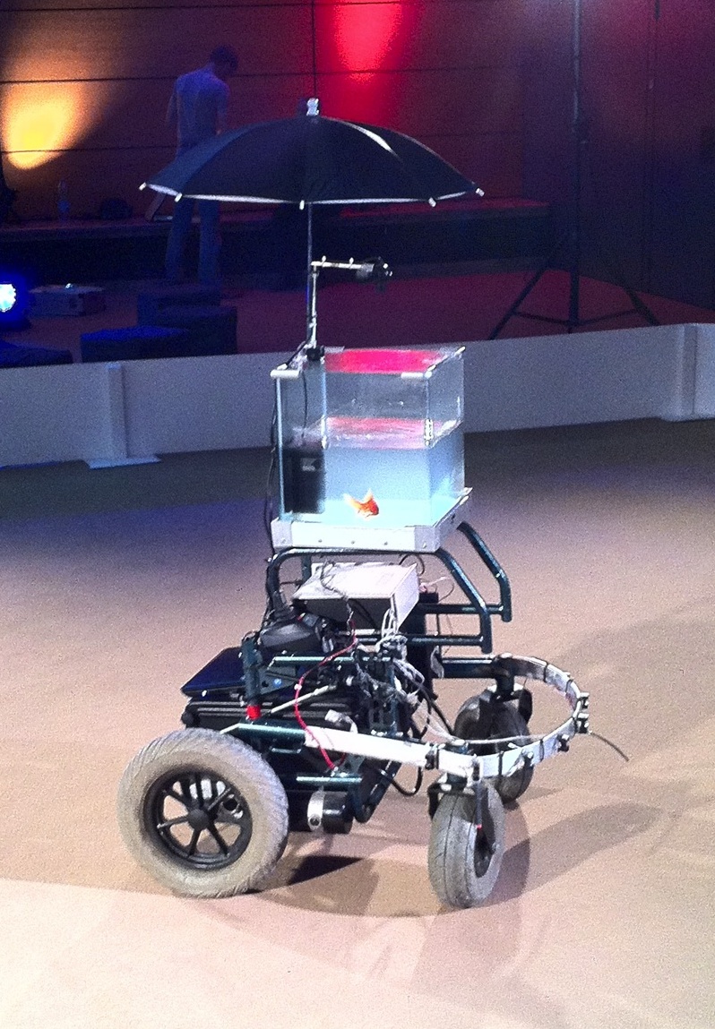
Lift also had an exhibitors section titled “the lift experience“, mostly a place for multimedia art (imagine a goldfish in a bowl sat atop an electric wheelchair, a camera captured the direction the fish swam in and the wheelchair would then move in the same direction). There were quite a few projects using the Arduino and even more that used “hacked” Kinects to enable new types of interaction languages.

Photo by Rick Marriner

Most projects tried, in some way, to negotiate a new way of working between the virtual and the real (or should I call it the visceral). As soon as those boundaries disappear designers will have an increased ability to shape reality. One of the projects that I engaged with the most was the UrbanMusicalGame: a set of gyroscopes and accelerometers hidden in soft balls. By playing with these balls you could make beautiful music while using an iPhone app to change the settings (unfortunately the algorithms were not yet optimized for my juggling). This type of project is the vanguard of what we will see in the near term.

Discomfort with the dehumanizing aspects of technology

A surprising theme for me was the well articulated discomfort with the dehumanizing aspects of some of the emerging digital technologies. As Benkler says: technology creates feasibility spaces for social practice and not all practices that are becoming feasible now have positive societal impact.

One artist, Emmanuel Germond, seemed to be very much in touch with these feeling. His project, Exposition au Danger Psychologique, made fun of people’s inability to deal with all this information and provided some coy solutions. Alex Peng talked about contemplative computing, Chris de Decker showed examples of low-tech solutions from the past that can help solve our current problems and projects in the Lift Experience showed things like analog wooden interfaces for manipulating digital music.

This leads me to believe that both physical reality and being disconnected will come at a premium in the near future. People will be willing to pay for having real experiences versus the ubiquitous virtual experiences. Not being connected to the virtual world will become more expensive as it becomes more difficult. Imagine a retreat which markets itself as having no wifi and a giving you a free physical newspaper in the morning (places like this are starting to pop up, see this unplugged conference or this reporter’s unconnected weekend).

There will be consequences for Learning and HR at large. For the last couple of years we have been moving more and more of our learning interventions into the virtual space. Companies have set up virtual universities with virtual classrooms, thousands and thousands of hours of e-learning are produced every year and the virtual worlds that are used in serious games are getting more like reality every month.

Thinking about the premium of reality it is then only logical that allowing your staff to connect with each other in the real world and collaborate in face to face meetings will be a differentiator for acquiring and retaining talent.

Big data for innovation

I’ve done a lot of thinking about big data this year (see for example these learning analytics posts) and this was a tangential topic at the conference. The clearest example came from a carpool site which can use it’s data about future reservation to clearly predict how busy traffic will be on a particular day. PatientsLikeMe is of course another example of a company that uses data as a valuable asset.

Supercrunchers is full of examples of data-driven solutions to business problems. The ease of capturing data, combined with the increase in computing power and data storage has made doing randomized trials and regression analysis feasible where before it was impossible.

This means that the following question is now relevant for any business: How can we use the data that we capture to make our products, services and processes better? Any answers?

The need to overcome the open/closed dichotomy

In my circles, I usually only encounter people who believe that most things should be open. Geoff Mulgan spoke of ways to synthesize the open/closed dichotomy. I am not completely sure how he foresees doing this, but I do know that both sides have a lot to learn from each other.

Disruptive software innovations currently don’t seem to happen int the open source world, but open source does manage to innovate when it comes to their own processes. They manage to scale projects to thousands of participants, have figured out ways of pragmatically dealing with issues of intellectual property (in a way that doesn’t inhibit development) and have created their own tool sets to make them successful at working in dispersed teams (Git being my favorite example).

When we want to change the way we do innovation in a networked world, then we shouldn’t look at the open source world for the content of innovation or the thought leadership, instead we should look at their process.

Your thoughts

A lot of the above is still very immature and incoherent thinking. I would therefore love to have a dialog with anybody who could help me deepen my thoughts on these topics.

Finally, to give a quick flavour of all my other posts about Lift 11, the following word cloud based on those posts:

Lift11 Word Cloud
My Lift 11 wordcloud, made with Wordle

Kaizen versus Good Enough

Arjen Vrielink and I write a monthly series titled: Parallax. We both agree on a title for the post and on some other arbitrary restrictions to induce our creative process. For this post we agreed to write about how Kaizen (the philosophy of continuous improvement) relates to the rise of the Good Enough paradigm. The post also has to include a non-digital example of Kaizen versus Good Enough. You can read Arjen’s post with the same title here.

The world is full of badly designed things. I find this infuriating. A little bit of thought by the designer could make many things so much easier to use. My favourite book on this topic is The Design of Everyday Things by Donald Norman. It is years ago since I read the book, but I can still remember Norman agitating against all kind of design flaws: why would an object as simple as a door need a manual (“push”). I have therefore decided to start a new Twitter account titled unusablestuff in which I post pictures of things that fail to be usable.

Through Alper I recently learnt about the Japanese concept of Kaizen. This is a philosophy of continuous improvement that aims to eliminate waste (wasted time, wasted costs, wasted opportunities, etc.). Kaizen as described on Wikipedia is very much a particular process that you can go through with a group of people:

Kaizen is a daily activity, the purpose of which goes beyond simple productivity improvement. It is also a process that, when done correctly, humanizes the workplace, eliminates overly hard work [..], and teaches people how to perform experiments on their work using the scientific method and how to learn to spot and eliminate waste in business processes.

I’d also like to see it as being a mindset.

Another thing I recently read was a Wired article titled: The Good Enough Revolution: When Cheap and Simple is just Fine.

Cheap, fast, simple tools are suddenly everywhere. We get our breaking news from blogs, we make spotty long-distance calls on Skype, we watch video on small computer screens rather than TVs, and more and more of us are carrying around dinky, low-power netbook computers that are just good enough to meet our surfing and emailing needs. The low end has never been riding higher. […]
what consumers want from the products and services they buy is fundamentally changing. We now favor flexibility over high fidelity, convenience over features, quick and dirty over slow and polished. Having it here and now is more important than having it perfect. These changes run so deep and wide, they’re actually altering what we mean when we describe a product as “high-quality.”

The article is full of examples where cheap, convenient and fast wins out over high quality. Think netbooks, MP3 files and the Flip videocamera.

Both ideas have their appeal to me, but at a superficial level they might seem to contradict each other. Why would you spend a lot of time trying to continually improve on something, when good enough is just good enough? This contradiction isn’t truly there. Good enough is essentially relevant at a higher level than Kaizen. Good enough means you design for a specific task, context, audience or zeitgeist and don’t add things that aren’t necessary. It is about simplicity and lowering the costs, but not about lowering the design effort. Kaizen is about the details: once you have decided to build a netbook (smaller screen, less processing power, but good enough for basic browsing on the net), you should still make sure to design it in such a way that people can use with a little waste as possible.

Oscar in the classic bin

Let’s look at garbage bins as an example. A garbage bin is a relatively simple product. It is a bin with a lid that can hold a bag in which you put the garbage. Oscar lives in one of the classic bins. In essence this is good enough. You don’t need auto-incinerators, sensors that tell you when the bag is full, odour protection, etc. The simple bin-lid-bag concept does have a couple of issues and problems that can be solved with good design.

The Brabantia 30 liter Retro Bin is a bin that has done exactly this. What problems are solved with the design of this bin and how?

Problem: Sometimes you need two hands to get your garbage in the bin. If you have to scrape some leftover peels from a cutting board for example. In that case you have no hands free to lift the lid of the bin.
Solution: You create a bin with a foot-pedal. A foot-pedal also keeps you hands clean as you don’t have to touch the lid of the bin which is often dirty.

Problem: When the bin is empty, pressing the pedal might make the bin move.
Solution: A rubber ring at the bottom prevents the bin from moving on any flooring.

Brabantia Retro Bin
Brabantia Retro Bin

Problem: It can be irritating to constantly have to press the pedal if you want to throw away multiple things and have to walk back and forth to get the garbage to throw in the bin.
Solution: Hinge the lid in such a way that if it opens all the way it stays open. Allow this to be done by a persistent movement of the foot on the pedal.

Problem: If the bag gets really full (by pressing down the garbage) it might press against the mechanism that is used to open the bin, making it hard to open.
Solution: Make sure that the mechanism for opening the lid on the basis of the pedal movement lies completely outside of the bin and is unaffected by the pressure.

Problem: When you put in a new bag it often happens that there is air trapped between the bag and the bin. This makes it hard to throw aways things as the full space of the bag is not used.
Solution: Put little holes in the top of the bags. This allows the air to escape when putting in a new bag.

Problem: There is often a vacuüm between the bag and the bin when you try to lift a full bag out. This gives you the feeling that the bag is stuck.
Solution: Have little holes in bottom of the sides of the bin. This way air can come in, preventing the vacuüm. Brabantia rightly thought that holes at the side of a bin look a bit weird, so they have created an inner bin and outer bin. This also solves an aesthetic (if not design) problem: the top edge of the bag being shown. This top edge now hides between the inner and the outer bin.

Problem: A lot of garbage has some liquid components. These liquids sometimes drip from the bottom of the bag.
Solution: Create an extra strong bottom for the bag of an extra impenetrable plastic.

Problem: When a bag is full it can be hard to tie it up.
Solution: First make sure that the bag is slightly bigger than the bin. Once the bag is out of the bin, the garbage has more space to spread and the top of the bag will have more space to tie up. Next, have a built-in string that can be used to tie up the bag (also highly useful for lifting out the bag). Make sure that this string is long enough to make for an easy knot.

I have had all these problems with garbage bins at some point, the Brabantia bin solves them all.

Many people will probably consider me a whiner (there are bigger problems in the world, can’t you get over these minor garbage issues?) or a weirdo (garbage bins, honestly?) and both are probably true, but that doesn’t negate my point. Getting a product on the market requires that is designed. Now think about the extra design effort to create a bin that solves common bin problems. How many more man months for the Brabantia design than for the classic “Oscar bin”? Now imagine the small problems that a user of a classic garbage bin encounters and multiply them by all the garbage bin users in this world. Any idea how many times an hour something is spilled in this world because there is no pedal on the bin? People like to blame themselves (“I am so terribly clumsy”), I like to blame the designer. Why not just spend some extra design effort and get it right?

I want to draw an analogy with the design of software. I think the believe in Kaizen is what makes Apple products stand out. The example I love to show people is the difference in the calculator on the Symbian S60 3rd edition (I used it on the Nokia E71, my previous phone) and on the iPhone (my current phone).

A calculator is a simple thing. Most people only need addition, subtraction, multiplication and division capabilities. Both default calculators deliver exactly this functionality. Nokia’s effort looks like this:

Nokia's default calculator

You need to use the keyboard (there are designated keys for the numbers) and the D-pad to make a calculation. The D-pad is necessary to navigate from one operator to the next. To do a simple calculation like 6 / 2 = 3 requires you to press eleven buttons!

The iPhone calculator looks like this:

iPhone's default calculator

You just use your finger to tap the right numbers and operators. 6 / 2 = 3 only requires four finger taps.

It is not just the touch interface that makes it possible to have a great working calculator. I managed to download another calculator for the Nokia phone, Calcium. It looks like this:

Calcium calculator
Calcium calculator

This calculator makes clever use of natural mapping to create a calculator that is as easy, if not easier, to use as Apple’s calculator. 6 / 2 = 3 takes indeed four button presses. Nokia could have made this. The fact that Nokia was willing to ship a phone with the default calculator as it was is one of the reasons why I have a hard time believing they have a bright future in the smartphone space.

In a next post I might rant about how many designers think the whole world is right-handed. Do you have any thoughts on design?

Beautiful Functional Design: The Strida Folding Bike

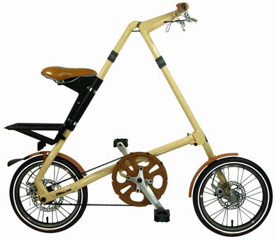
The Strida unfolded
The Strida unfolded

As regular readers of this blog might have noticed: I love great technology. When I talk about technology, I push the concept slightly further than most web aficionados might do. It is not just gadgets that I like, but any well designed tool that can make my life easier is much appreciated. A great blog to see examples of what I am talking about is Kevin Kelly’s Cool Tools blog.

I have a many pieces of technology that I really like and use often. Some examples: a Leatherman Juice Cs4 multitool, a Brabantia bin ,a Samsung NC-10 netbook running Ubuntu, a Solis Citrus Press, a Victorinox Trevi 17 briefcase or a Microplane Grater). All of these products have one thing in common: they have been extremely carefully designed for the task at hand. Every element has been consciously put in place and considered. This is refreshing in a world of more and more crap. One of my favourite books on the topic of design is Donald Norman’s classic The Design of Everyday Things. He outlines some design principles that many products violate which consequently makes them hard to use. What he does not address is the creative inspiration that is needed for truly great products.

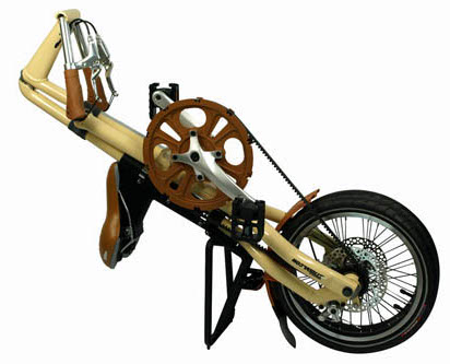
The Strida folded
The Strida folded

My latest technology acquisition does have this creative inspiration. It is a Strida folding bike. This brilliant piece of engineering will help me get to and from the train station every day. The Strida was featured on Cool tools a little while ago and I completely agree with everything the reviewer writes there.

The bike is very low maintenance. It uses a Kevlar belt instead of a chain, so no grease to get on your clothes. It rides a bit like a sports car drives: the handling is very direct. You sit up straight while riding the bike, giving you a good overview of traffic. As you can see on the Youtube video below, the (un)folding process is incredibly fast:

[youtube=http://www.youtube.com/v/fRmfMszDbWo]

The joy is in the details: little loops allow you to lock the brakes, so that the bike can’t roll away when standing up and the carrier on the back doubles as a stand when lying down. Even the marketing people did a good job (in general I am not fond of marketeers). They know that people will ask you about the bike in wonderment, so they have provided a case of Strida business cards underneath the saddle that you can hand out.