Two weeks ago I visited Learning Technologies 2011 in London (blog post forthcoming). This meant I had less time to write down some thoughts on Lak11. I did manage to read most of the reading materials from the syllabus and did some experimenting with the different tools that are out there. Here are my reflections on week 3 and 4 (and a little bit of 5) of the course.
The Semantic Web and Linked Data
This was the main topic of week three of the course. Basically the semantic web has a couple of characteristics. It tries to separate the presentation of the data and the data itself. It does this by structuring the data which then allows linking up all the data. The technical way that this is done is through so-called RDF-triples: a subject, a predicate and an object.
Although he is a better writer than speaker, I still enjoyed this video of Tim Berners-Lee (the inventor of the web) explaining the concept of linked data. His point about the fact that we cannot predict what we are going to make with this technology is well taken: “If we end up only building the things I can imagine, we would have failed“.
[youtube=http://www.youtube.com/watch?v=OM6XIICm_qo]
The benefits of this are easy to see. In the forums there was a lot of discussion around whether the semantic web is feasible and whether it is actually necessary to put effort into it. People seemed to think that putting in a lot of human effort to make something easier to read for machines is turning the world upside down. I actually don’t think that is strictly true. I don’t believe we need strict ontologies, but I do think we could define more simple machine readable formats and create great interfaces for inputting data into these formats.
Use cases for analytics in corporate learning
Weeks ago Bert De Coutere started creating a set of use cases for analytics in corporate learning. I have been wanting to add some of my own ideas, but wasn’t able to create enough “thinking time” earlier. This week I finally managed to take part in the discussion. Thinking about the problem I noticed that I often found it difficult to make a distinction between learning and improving performance. In the end I decided not to worry about it. I also did not stick to the format: it should be pretty obvious what kind of analytics could deliver these use cases. These are the ideas that I added:
- Portfolio management through monitoring search terms
You are responsible for the project management portfolio learning portfolio. In the past you mostly worried about “closing skill gaps” through making sure there were enough courses on the topic. In recent years you have switched to making sure the community is healthy and you have switched from developing “just in case” learning intervention towards “just in time” learning interventions. One thing that really helps you in doing your work is the weekly trending questions/topics/problems list you get in your mailbox. It is an ever-changing list of things that have been discussed and searched for recently in the project management space. It wasn’t until you saw this dashboard that you noticed a sharp increase in demand for information about privacy laws in China. Because of it you were able to create a document with some relevant links that you now show as a recommended result when people search for privacy and China. - Social Contextualization of Content
Whenever you look at any piece of content in your company (e.g. a video on the internal YouTube, an office document from a SharePoint site or news article on the intranet), you will not only see the content itself, but you will also see which other people in the company have seen that content, what tags they gave it, which passages they highlighted or annotated and what rating they gave the piece of content. There are easy ways for you to manage which “social context” you want to see. You can limit it to the people in your direct team, in your personal network or to the experts (either as defined by you or by an algorithm). You love the “aggregated highlights view” where you can see a heat map overlay of the important passages of a document. Another great feature is how you can play back chronologically who looked at each URL (seeing how it spread through the organization). - Data enabled meetings
Just before you go into a meeting you open the invite. Below the title of the meeting and the location you see the list of participants of the meeting. Next to each participant you see which other people in your network they have met with before and which people in your network they have emailed with and how recent those engagements have been. This gives you more context for the meeting. You don’t have to ask the vendor anymore whether your company is already using their product in some other part of the business. The list also jogs your memory: often you vaguely remember speaking to somebody but cannot seem to remember when you spoke and what you spoke about. This tools also gives you easy access to notes on and recordings of past conversations. - Automatic “getting-to-know-yous”
About once a week you get an invite created by “The Connector”. It invites you to get to know a person that you haven’t met before and always picks a convenient time to do it. Each time you and the other invitee accept one of these invites you are both surprised that you have never met before as you operate with similar stakeholders, work in similar topics or have similar challenges. In your settings you have given your preference for face to face meetings, so “The Connector” does not bother you with those video-conferencing sessions that other people seem to like so much. - “Train me now!”
You are in the lobby of the head office waiting for your appointment to arrive. She has just texted you that she will be 10 minutes late as she has been delayed by the traffic. You open the “Train me now!” app and tell it you have 8 minutes to spare. The app looks at the required training that is coming up for you, at the expiration dates of your certificates and at your current projects and interests. It also looks at the most popular pieces of learning content in the company and checks to see if any of your peers have recommended something to you (actually it also sees if they have recommended it to somebody else, because the algorithm has learned that this is a useful signal too), it eliminates anything that is longer than 8 minutes, anything that you have looked at before (and haven’t marked as something that could be shown again to you) and anything from a content provider that is on your blacklist. This all happens in a fraction of a second after which it presents you with a shortlist of videos for you to watch. The fact that you chose the second pick instead of the first is of course something that will get fed back into the system to make an even better recommendation next time. - Using micro formats for CVs
The way that a simple structured data format has been used to capture all CVs in the central HR management system in combination with the API that was put on top of it has allowed a wealth of applications for this structured data.
There are three more titles that I wanted to do, but did not have the chance to do yet.
- Using external information inside the company
- Suggested learning groups to self-organize
- Linking performance data to learning excellence
Book: Head First Data Analytics
I have always been intrigued by O’Reilly’s Head First series of books. I don’t know any other publisher who is that explicit about how their books try to implement research based good practices like an informal style, repetition and the use of visuals. So when I encountered Data Analysis in the series I decided to give it a go. I wrote the following review on Goodreads:
The “Head First” series has a refreshing ambition: to create books that help people learn. They try to do this by following a set of evidence-based learning principles. Things like repetition, visual information and practice are all incorporated into the book. This good introduction to data analysis, in the end only scratches the surface and was a bit too simplistic for my taste. I liked the refreshers around hypothesis testing, solver optimisation in Excel, simple linear regression, cleaning up data and visualisation. The best thing about the book is how it introduced me to the open source multi-platform statistical package “R”.
Learning impact measurement and Knowledge Advisers
The day before Learning Technologies, Bersin and KnowledgeAdvisors organized a seminar about measuring the impact of learning. David Mallon, analyst at Bersin, presented their High-Impact Measurement framework.

The thing that I thought was interesting was how the maturity of your measurement strategy is basically a function of how much your learning organization has moved towards performance consulting. How can you measure business impact if your planning and gap analysis isn’t close to the business?
Jeffrey Berk from KnowledgeAdvisors then tried to show how their Metrics that Matter product allows measurement and then dashboarding around all the parts of the Bersin framework. They basically do this by asking participants to fill in surveys after they have attended any kind of learning event. Their name for these surveys is “smart sheets” (an much improved iteration of the familiar “happy sheets”). KnowledgeAdvisors has a complete software as a service based infrastructure for sending out these digital surveys and collating the results. Because they have all this data they can benchmark your scores against yourself or against their other customers (in aggregate of course). They have done all the sensible statistics for you, so you don’t have to filter out the bias on self-reporting or think about cultural differences in the way people respond to these surveys. Another thing you can do is pull in real business data (think things like sales volumes). By doing some fancy regression analysis it is then possible to see what part of the improvement can be attributed with some level of confidence to the learning intervention, allowing you to calculate return on investment (ROI) for the learning programs.
All in all I was quite impressed with the toolset that they can provide and I do think they will probably serve a genuine need for many businesses.
The best question of the day came from Charles Jennings who pointed out to David Mallon that his talk had referred to the increasing importance of learning on the job and informal learning, but that the learning measurement framework only addresses measurement strategies for top-down and formal learning. Why was that the case? Unfortunately I cannot remember Mallon’s answer (which probably does say something about the quality or relevance of it!)
Experimenting with Needlebase, R, Google charts, Gephi and ManyEyes
The first tool that I tried out this week was Needlebase. This tool allows you to create a data model by defining the nodes in the model and their relations. Then you can train it on a web page of your choice to teach it how to scrape the information from the page. Once you have done that Needlebase will go out to collect all the information and will display it in a way that allows you to sort and graph the information. Watch this video to get a better idea of how this works:
[youtube=http://www.youtube.com/watch?v=58Gzlq4zSDk]
I decided to see if I could use Needlebase to get some insights into resources on Delicious that are tagged with the “lak11” tag. Once you understands how it works, it only takes about 10 minutes to create the model and start scraping the page.
I wanted to get answers to the following questions:
- Which five users have added the most links and what is the distribution of links over users?
- Which twenty links were added the most with a “lak11” tag?
- Which twenty links with a “lak11” tag are the most popular on Delicious?
- Can the tags be put into a tag cloud based on the frequency of their use?
- In which week were the Delicious users the most active when it came to bookmarking “lak11” resources?
- Imagine that the answers to the questions above would be all somebody were able to see about this Knowledge and Learning Analytics course. Would they get a relatively balanced idea about the key topics, resources and people related to the course? What are some of the key things that would they would miss?
Unfortunately after I had done all the machine learning (and had written the above) I learned that Delicious explicitly blocks Needlebase from accessing the site. I therefore had to switch plans.
The Twapperkeeper service keeps a copy of all the tweets with a particular tag (Twitter itself only gives access to the last two weeks of messages through its search interface). I manage to train Needlebase to scrape all the tweets, the username, URL to user picture and userid of the person adding the tweet, who the tweet was a reply to, the unique ID of the tweet, the longitude and latitude, the client that was used and the date of the tweet.
I had to change my questions too:
- Which ten users have added the most tweets and what is the distribution of tweets over users?
This was easy to get and graph with Needlebase itself:
Top 11 Lak11 Twitter Users I personally like treemaps for this kind of data, so I tried to create one in IBM’s ManyEyes. Unfortunately they seem to have some persistent issues with their site:
- Which twenty links were added the most with a “lak11” tag? Another way of asking this would be: which twenty links created the most buzz?
This was a bit harder because Needlebase did not get the links for me. I had to download all the text into a text file and use some regular expressions to get a list of all the URLs in the tweets. 796 of the 967 tweets had a URL (that is more than 80%), 453 of these were unique. I could then do some manipulations in a spreadsheet (sorting, adding and some appending) to come up with a list. Most of these URLs are shortened, so I had to check them online to get their titles. This is the result:- Elluminate | Session Log-in (23 mentions)
- Learning Analytics Syllabus – Google Docs (17 mentions)
- The # LAK11 Daily (15 mentions)
- Elluminate | Session Log-in (14 mentions)
- Where do we find good critiques of learning analytics? | Learning and Knowledge Analytics (10 mentions)
- MOOC newbie voice “a slackers entrance into lak11″» Dave’s Educational Blog (10 mentions)
- Half an Hour: Why the Semantic Web Will Fail (9 mentions)
- Artifacts of sensemaking | Learning and Knowledge Analytics (9 mentions)
- Help Me Understand The Buzz Around Learning Analytics | FunnyMonkey (9 mentions)
- Social Networks in Action – Learning Networks @ UOW (8 mentions)
- Reflections on Open Courses: Curation, Ombuds, and Concierges | Learning and Knowledge Analytics (7 mentions)
- Course: Learning and Knowledge Analytics (7 mentions)
- YouTube – What is Hadoop? Other big data terms like MapReduce? Cloudera’s CEO talks us through big data trends (6 mentions)
- @Ignatia Webs: #LAK11 a free and open #elearning course on #statistics starts today, join!Ignatia Webs (6 mentions)
- Learning & Knowledge Analytics 2011 (6 mentions)
- for the love of learning: Measurable Outcomes (6 mentions)
- Free project in the clouds for teachers around the world http://web20ineducation2010.ning.com/: applications, e-safety, education, education , social media, tools, web 2.0 | Glogster EDU – 21st century multimedia tool for educators, teachers and students (6 mentions)
- Study Group: Learning Analytics | OpenStudy (6 mentions)
- Course: Learning and Knowledge Analytics (6 mentions)
- http://paper.li/tag/LAK11 (5 mentions)
- What other hashtags are used next to Lak11?
Here I used a similar methodology as for the URLs. In the end I had a list of all the tags with their frequencies. I used Wordle and ManyEyes to put them into tag clouds:
Wordle Lak11 Hashtags 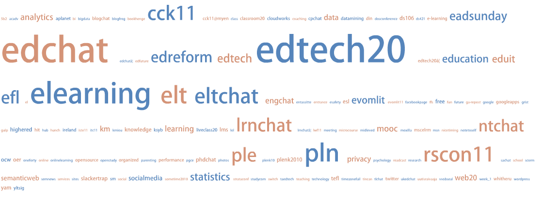
ManyEyes Lak11 Hashtags Also compare them to tag clouds of the complete texts of the tweets (cleaned up to remove usernames, “RT”, “Lak11” URLs and the # in front of the hash tags):
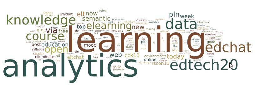
Wordle Lak11 Tweets Texts 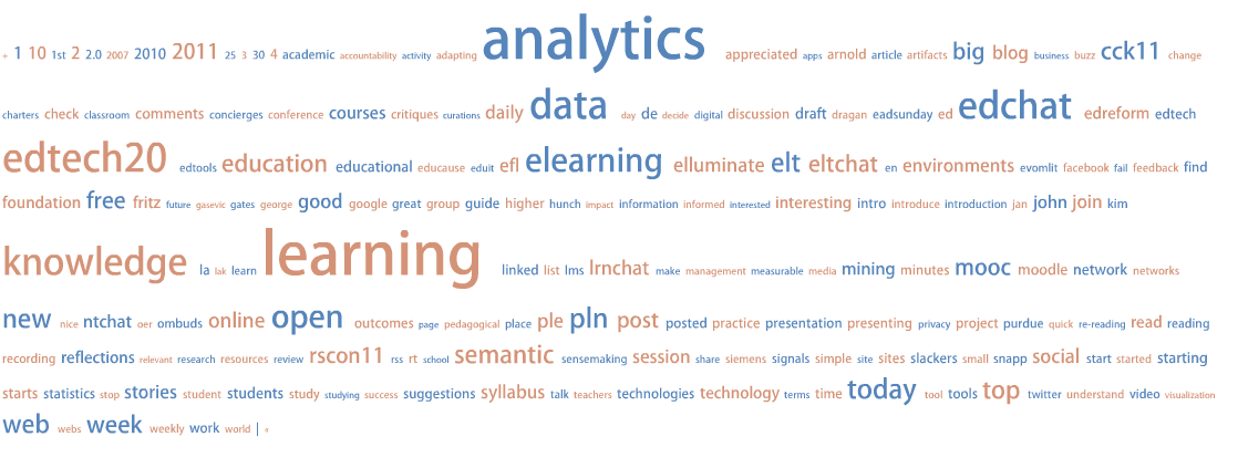
ManyEyes Lak11 Tweets Texts Which one do you find more insightful? I personally prefer the latter one as it would give somebody who knows nothing about Lak11 a good flavor of the course.
- How are the Tweets distributed over time? Is the traffic increasing with time or decreasing?
I decided to just get a simple list of days with the number of tweets per day. As an exercise I wanted to graph it in R. These are the results: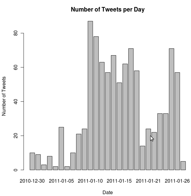
Tweets per day I couldn’t learn anything interesting from that one.
- Imagine that the answers to the questions above would be all somebody were able to see about this Knowledge and Learning Analytics course. Would they get a relatively balanced idea about the key topics, resources and people related to the course? What are some of the key things that would they would miss? If you would automate getting answers to all these question (no more manual writing of regex!) would that be useful for learners and facilitators?
I have to say that I was pleasantly surprised by how fruitful the little exercise with getting the top 20 links was. I really do believe that these links capture much of the best materials of the first couple of weeks of the course. If you would use the Wordle as the single image to give a flavour of the course and then point to the 20 URLs and get the names of the top Twitterers, than you would be off to badly.
One problem I noticed is that two of the twenty results were the same URL with a different shortened URLs (the link to the Moodle course and to the Paper.li paper): URL shorteners make the web the more difficult place in many ways.
Another great resource that I re-encountered in these weeks of the course was the Rosling’s Gapminder project:
[youtube=http://www.youtube.com/watch?v=BPt8ElTQMIg]
Google has acquired some part of that technology and thus allows a similar kind of visualization with their spreadsheet data. What makes the data smart is the way that it shows three variables (x-axis, y-axis and size of the bubble and how they change over time. I thought hard about how I could use the Twitter data in this way, but couldn’t find anything sensible. I still wanted to play with the visualization. So at the World Bank’s Open Data Initiative I could download data about population size, investment in education and unemployment figures for a set of countries per year (they have a nice iPhone app too). When I loaded that data I got the following result:

The last tool I installed and took a look at was Gephi. I first used SNAPP on the forums of week and exported that data into an XML based format. I then loaded that in Gephi and could play around a bit:

My participation in numbers
I will have to add up my participation for the two (to three) weeks, so in week 3 and week 4 of the course I did 6 Moodle posts, tweeted 3 times about Lak11, wrote 1 blogpost and saved 49 bookmarks to Diigo.
The hours that I have played with all the different tools mentioned above are not mentioned in my self-measurement. However, I did really enjoy playing with these tools and learned a lot of new things.
