Christopher Alexander’s “A Pattern Language”

A Pattern Language
A Pattern Language

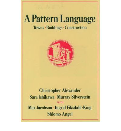
I have just finished reading Christopher Alexander‘s A Pattern Language: Towns – Buildings – Construction, one of the most wonderful books I have read in years.

The scope of the book is incredible. It sets out, in plain terms, to empower people to design, build and shape their own surroundings. It does this by creating a “pattern language”, a kind of generative grammar with 253 patterns that can be used to make things. The patterns move from big town scale patterns (e.g. The Distribution of Towns, Magic of the City, Web of Shopping, Nine per Cent Parking), via medium building scale patterns (e.g. Wings of Light, Intimacy Gradient, Staircase as a Stage) to small  construction scale patterns (e.g. Structure follows Social Spaces, Low Sill, Filtered Light, Different Chairs).

Each pattern is described in a similar way: there is a picture showing an archetypal example of the pattern, then a paragraph describing the context of the pattern (in which larger patterns does this pattern fit), next in bold a headline giving the essence of the problem, then a research based exploration of the problem, next in bold the solution stated as an instruction, then a diagram as a visual way of describing the solution and finally a paragraph describing which smaller patterns can help this pattern. Each pattern also comes with a label signifying how sure the authors are that this truly is an universal pattern.

The breadth of topics in the book is baffling (it took the authors about seven years to research and write it). Let me just give you some random quotes to show you what I mean (doing the book a gross injustice by leaving out a lot of context).

On the magic of a cities:

The magic of a great city comes from the enormous specialization of human effort there. Only a city such as New York can support a restaurant where you can eat chocolate-covered ants, or buy three-hundred-year-old books of poems, or find a Caribbean steel band playing with American Folk singers.

On the evils of supermarkets:

It is true that the large supermarkets do have a great variety of foods. But this “variety” is still centrally purchased, centrally warehoused, and still has the staleness of mass merchandise. In addition, there is no human contact left, only rows of shelves and then a harried encounter with the check-out man who takes your money.

On grave sites:

No people who turn their backs on death can be alive. The presence of the dead among the living will be a daily fact in any society which encourages its people to live.

On why buildings should have gradients of intimacy:

When there is a gradient of this kind, people can give each encounter different shades of meaning, by choosing its position on the gradient very carefully. In a building which has its rooms so interlaced that there is no clearly defined gradient of intimacy, it is not possible to choose the spot for any particular encounter so carefully; and it is therefore impossible to give the encounter this dimension of added meaning by the choice of space. This homogeneity of space, where every room has a similar degree of intimacy, rubs out all possible subtlety of social interaction in the building.

On why your windows should have relatively small panes:

[Thomas Markus] points out that small and narrow windows afford different views from different positions in the room, while the view tends to be the same through large windows or horizontal ones. We believe that the same thing, almost exactly, happens within the window frame itself. [..] The view becomes alive because the small panes make it so.

On lighting every room from two sides:

When they have a choice, people will always gravitate to those rooms which have light on two sides, and leave the rooms which are lit only from one side unused and empty.
This pattern, perhaps more than any other single pattern determines the success or failure of a room. The arrangement of daylight in a room, and the presence of windows on two sided, is fundamental. If you build a room with light on one side only, you can be almost certain that you are wasting your money.

On modern impersonal interior design:

Do not be tricked into believing that modern decor must be slick or psychedelic or “natural” or “modern art,” or “plants” or anything else that current taste-makers claim. It is most beautiful when it comes straight from your life – the things you care for, the things that tell your story.

On high buildings (imposing a four story limit):

There is abundant evidence to show that high building make people crazy.
High buildings have no genuine advantages, except in speculative gains for banks and land owners. They are not cheaper, they do not help create open space, they destroy the townscape, they destroy social life, they promote crime, they make life difficult for children, they are expensive to maintain, they wreck the open spaces near them, and they damage light and air and view. But quite apart from all this, which shows that they aren’t very sensible, empirical evidence shows that they can actually damage people’s minds and feelings.

I could go on and on…

Written in 1977 it is clear that this is a very “seventies” book. The belief in what we in The Netherlands would call “De maakbaarheid van de samenleving” (the ability to create/design/mold society) is very high. It was interesting to reflect on where I grew up and how much of that place was designed according to the same kind of thinking and ideals. I could also find many of seventies based educational philosophy of the school I used to work at in the book. The open doors, the integration of inside and outside, there are even some very explicit ideas on education and learning in the book.

Although many of the patterns are probably very universal (they are very human), I do think the book has some strong cultural biases. This doesn’t make it less valuable though.

The book has really made me want to scratch my own creator’s itch. It makes you want to design things. (Apparently Will Wright, the creator of SimCity, wanted to create this game after reading the book).

What I want to create, inspired by this book, is not a town or a house. I want to write a new pattern language. Wouldn’t it be great if we had a generative grammar for technology enhanced education (or using another term, online learning events)? I see that there have been some attempts to do this already (here and here), but I would love to create a much more extensive work that is in the style of Alexander. Is there anybody who would like to help me? Shall I start a wiki?

If you want more information about the book, then go to its website or read hyperlinked summaries of all patterns.
The Influence of a Workspace On Performance

Arjen Vrielink and I write a monthly series titled: Parallax. We both agree on a title for the post and on some other arbitrary restrictions to induce our creative process. For this post we agreed to write about the influence of a workspace on performance. The discussion should build on the ideas set forth in a previous parallax post Planning your Career or the Boundary between Private and Professional life. You can read Arjen’s post with the same title here.

I have written before about the direct influence of our environment on our behaviour. I think learning professionals can learn a lot from people like Hans Monderman. This traffic engineer looked with a fresh eye at how people and technology relate to each other. This led to some ground-breaking traffic concepts (quote from Wikipedia):

His most famous design approach is Shared Space, also known as designing for negotiation or Shared Streets. Monderman found that the traffic efficiency and safety of urban streets improved when the street and surrounding public space was redesigned to encourage each person to negotiate their movement directly with others. Shared Space designs typically call for removing regulatory traffic control features (such as kerbs, lane markings, signs and lights) and replacing intersections with roundabouts.

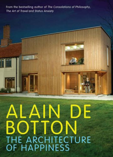
The Architecture of Happiness

Our surroundings change who we are. I was therefore delighted to learn that Alain de Botton has written a book about exactly this topic, applying it to the architectural domain: The Architecture of Happiness. In it he writes about one of my favourite architectural topics: Le Corbusier and his plans for the Radiant City:

By building upwards, two problems would be resolved at a stroke: overcrowding and urban sprawl. With room enough for everyone in towers, there would be no need for cities to spread outwards and devour the countryside in the process. ‘We must eliminate the suburbs,’ recommend Le Corbusier, whose objection was as much based on his hatred of what he took to be the narrow mental outlook of suburbanites as on the aesthetics of their picket-fenced villas. In the new kind of city, the pleasures of the town would be available to all. Despite a population density of 1,000 per hectare, everyone would be comfortably housed. Even the concierge would have his own study, added Le Corbusier.

There would be ample green space as well, as up to 50 per cent of urban land would be devoted to parks – for, as the architect put it, ‘the sports ground must be at the door of the house.’ What was more, the new city would not merely have parks; it would itself be a vast park, with large towers dotted among the trees. On the roofs of the apartment blocks, there would be games of tennis, and sunbathing on the shores of the artificial beaches.

Simultaneously, Le Corbusier planned to abolish the city street: ‘Our streets no longer work. Streets are an obsolete notion. There ought not to be such things as streets; we have to create something that will replace them.’ He witheringly pointed out that the design of Paris’s street plan dated from the middle of the sixteenth century, when ‘the only wheeled traffic consisted of two vehicles, the Queen’s coach and that of the Princess Diane.’ He resented the fact that the legitimate demands of both cars and people were constantly and needlessly compromised, and he therefore recommended that the two henceforth be separated. In the new city, people would have footpaths all to themselves, winding through woods and forests (‘No pedestrian will ever meet an automobile, ever!’), while cars would enjoy massive and dedicated motorways, with smooth, curving interchanges, thus guaranteeing that no driver would ever have to slow down for the sake of a pedestrian. [..]

The division of cars and people was but one element in Le Corbusier’s plan for a thoroughgoing reorganisation of the life in the new city. All functions would now be untangled. There would no longer be factories, for example, in the middle of residential areas, thus no more forging of iron while children were trying to sleep nearby.

This rational (at first sight) design for cities has an intuitive appeal. It is therefore not surprising that many municipalities have created whole neighbourhoods according to Le Corbusier’s principles. I have worked in one of these neighbourhoods for many years: the Bijlmer. The Bijlmer can be considered an urban design failure. Its giant apartment flats have mostly been demolished or rebuilt within the first 30 years of their existence.

Urban planners could (should?) have known better. Jane Jacobs wrote The Death and Life of Great American Cities in 1961, delivering a damning critique of Le Corbusier’s idea of separating the different functions of a city. De Botton writes it down very elegantly too (apologies for another long quote, I think they are worthwhile though!):

Ironically, what Le Corbusier’s dreams helped to generate were the dystopian housing estates that now ring historic Paris, the waste lands from which tourist avert their eyes in confused horror and disbelief on their way into the city. To take an overland train to the most violent and degraded of these places is to realise all that Le Corbusier forgot about architecture and, in a wider sense, about human nature.

For example, he forgot how tricky it is when just a few of one’s 2,699 neighbours decide to throw a party or buy a handgun. He forgot how drab reinforced concrete can seem under a grey sky. He forgot how awkward it is when someone lights a fire in the lift and home is on the fourty-fourth floor. He forgot, too, that while there is much to have about slums, one things we don’t mind about them is their street plan. We appreciate buildings which form continuous lines around us and make us feel as safe in the open air as we do in a room. There is something enervating about a landscape neither predominantly free of buildings nor tightly compacted, but littered with towers distributed without respect for edges or lines, a landscape which denies us the true pleasures of both nature and urbanisation. And because such an environment is uncomfortable, there is always a greater risk that people will respond abusively to it, that they will come to the ragged patches of earth between their towers and urinate on tyres, burn cars, inject drugs – and express all the darkest sides of their nature against which the scenery can mount no protest.

In his haste to distinguish cars from pedestrians, Le Corbusier also lost sight of the curious codependence of these two apparently antithetical forces. He forgot that without pedestrians to slow them down, cars are apt to go too fast and kill their drivers, and that without the eyes of cars on them, pedestrians can feel vulnerable and isolated. We admire New York precisely because the traffic and crowds have been coerced into a difficult but fruitful alliance.

A city laid out on apparently rational grounds, where different specialised facilities (the houses, the shopping centre, the library) are separated from one another across a vast terrain connected by motorways, deprives its inhabitants of the pleasure of incidental discoveries and presupposes that we march from place to place with a sense of unflagging purpose. But whereas we may leave the house with the ostensible object of consulting a book in a library, we may nevertheless be delighted on the way by the sight of the fishmonger laying out his startled, bug-eyed catch on sheets of ice, by workmen, hoisting patterned sofas into apartment blocks, by leaves opening their tender green palms to the spring sunshine, or by a girl with chestnut hair and glasses reading a book at the bus stop.

The addition of shops and offices adds a degree of excitement to otherwise inert, dormitory areas. Contact, even of the most casual kind, with commercial enterprises gives us a transfusion of an energy we are not always capable of producing ourselves. Waking up isolated and confused at three in the morning, we can look out of the window and draw solace from the blinking neon signs in a storefront across the road, advertising bottled beer or twenty-four-hour pizza and, in their peculiar way, evoking a comforting human presence through the paranoid early hours.

All of this, Le Corbusier forgot – as architects often will.

This is a very long pre-amble to the topic at hand: how the workspace can affect performance.

Shell's Learning Centre in Rijswijk

Most of my time I work in an office in Rijswijk that has been designed by David Leon. The longer I work there, the more impressed I have become by the attention to detail of its indoor design. The designers obviously have a very deep understanding of how people work nowadays and have created a work environment that enables people to get the best out of their day. How is this done?

  • The office space is open (no cubicles), but permanent storage areas and desks have been placed in such a way that privacy is ensured.
  • There are a multitude of different flexible rooms available: cockpits for one person (ideal for when you need to concentrate on getting something done), small rooms with two low chairs (great for having an informal chat), rooms with a table and a cornered bench (excellent for small brainstorms) and bigger rooms with oval meeting tables (sometimes with video calling facility). We even have rooms with wacky furniture to get the creativity going.
  • Connectivity in each room and at each desk. There are docking stations everywhere and each room has a speaker phone.
  • There is a lot of transparency: doors are made of glass and most meeting rooms are like semi-fishbowls with one or more walls completely done in glass.
  • The finishing is meticulous and natural. The orange colour is relaxing, cupboards have a wood finishing and in the heavy traffic areas (where carpeting can’t work) there are beautiful black natural stone tiles.
  • The overall layout allows small work communities (10-20 people) to form naturally. These work communities then share elevators, toilets, kitchen areas, allowing for broader networking too.

There are many similarities with the post I wrote about planning your career. Many of the things that keep you in the “Hooray!” zone on a career (macro level) are also relevant on the micro level when it comes to doing day-to-day work. Transparency, flexibility, the opportunities for networking and the use of technology are what make my office great.

People, Place, Process
People, Place, Process by David Leon

My company seems to understand this too. There is a reason why they hired David Leon, who write on their website:

Innovation depends on bright people. These people cost more and are far more valuable than the buildings they occupy… but it is a proven fact that the environment in which they work has a major impact on their effectiveness.

For that reason we design workplaces and buildings round the needs of people and the business aims of their organisations.

It is therefore stupefying that I am forced to use a locked down version of Microsoft Windows 2000 with Internet Explorer 6 as a primary workspace every single day of my working life (currently all employees are migrating to a locked down version MS Vista, this should be finished by the end of the first quarter). I think this is a big mistake and know that many people are not as productive as they could have been because of this.

I estimate that I am about 50% more productive on a laptop that is exactly configured to my specifications. The ability to use the applications that I want on the operating system that I prefer (that would be Ubuntu) would make a huge difference. It is the small details that make all the difference. I can’t use my normal keyboard shortcuts, I don’t have access to the command line to do things in batch, I don’t have a decent browser, I cannot edit images; I could go on much longer.

Many of the sites I need to look at don’t even work on IE6 anymore. The other day I browsed to drop.io from work and got the following message:

drop.io IE6 message
drop.io IE6 message (click to enlarge)

Embarrassing right?

So, here is my recommendation to all companies:

At all times allow your employees the freedom to use the technology they want

Yes, this means that you cannot standardise on hardware and software.

Yes, this means you have to allow access to your network from the device that your employee chooses.

Yes, this means you will have to support open standards so that people with a Mac or running Linux can access your applications.

Yes, you will need more bandwidth because you will have to allow YouTube and Facebook.

Yes, you will have extra costs because of all this.

But these extra costs will easily be offset by the extra productivity that your employees can deliver for you. In a couple of years it might actually become difficult to find employees that want to work for your company if you don’t heed to this recommendation.

Is your productivity affected by your workspace? Does your company allow you to choose your hardware? Can you install the software that you want and/or need? I look forward to any comments.

The Reichstag Dome: Norman Foster is a Genius

Reichstag, Berlin, photo by chris-dcx cc by-nc-nd

This evening I had the chance to go to the Reichstag in Berlin. This incredible building currently houses the German parliament (the Bundestag).

Admission to the magnificent dome is free. The last people are allowed in at 22:00 and are then allowed to stay till midnight. I hope our Dutch public institutions will take the Reichstag as an example.

The view of Berlin at night was impressive. Walking up the spiral (which is separate from the downward one) make you see the full panorama about three times.

The dome was designed by Norman Foster and built to symbolise the reunification of Germany. When you look down towards the inside you can see the seats of the parliament which get direct sunlight reflected through the mirrored cone in the centre of the dome.

Looking at that mirrored cone I suddenly realised Foster’s brilliance: the cone not only allows sunlight in, it also must allow the people sitting in the parliament seats to oversee all of Berlin when they look up. To me this makes the dome a wonderful physical realisation of a metaphor for not performing omphaloskepsis, but instead looking outward to the world at large.

A great city, Berlin.