DrupalJam in 7 tweets (Awesöme?!)

Arjen Vrielink and I write a monthly series titled: Parallax. We both agree on a title for the post and on some other arbitrary restrictions to induce our creative process. For this post we agreed to write about DrupalJam 6 by commenting on 7 tweets that have a #drupaljam hashtag. You can read Arjen’s post with the same title here.

DrupalJam
DrupalJam

DrupalJam 6 was held in Amsterdam on March 19th 2010. I have never really used Drupal, but as a project it has many similarities to Moodle and that makes it interesting to me. Just like Moodle it was started by a single very sociable person with a vision, just like Moodle it is a PHP application and just like Moodle it is the de facto mindshare (if not market) leader in its field. All the similarities make looking at the differences even more interesting. Moodle has commercialised through a decentralised network of Moodle partners, whereas Drupal has chosen a venture capital backed route with Acquia.Martin Dougiamas has decided to commercialise the Moodle trademark through a decentralised network of Moodle partners, whereas Dries Buytaert has chosen a venture capital backed route by creating a company specialising in Drupal services: Acquia, allowing other companies to (often freely) license the Drupal trademark too. (Text deleted and added after a comment by Bert Boerland, thanks!) The DrupalJam was more product focused (in the sense of software focused) than your standard Moodlemoot. This makes sense: DrupalJam visitors only share the fact that they use Drupal (the contents of their site can be about anything) whereas Moodlemoot visitors usually also share a passion for education.

Let’s cut to the chase: During the DrupalJam I kept monitoring the #drupaljam hashtag using Tweetie 2. I then favourited every tweet that I thought was interesting and could be used for this post. Out of the twenty or so favourites I selected these 7 to share with you.

1. tkeppens: Het zou fantastisch zijn de #drupaljam sessies na de conf als screencast te kunnen zien. Drukke agenda laat niet toe er te zijn. : – ( #drupal
A quick translation: “It would be fantastic if #drupaljam sessions would be viewable as a screencast after the conf. Busy agenda doesn’t permit me to attend”. Technology is now at a stage where even for a non-commercial event, this should be feasible. Presentation capturing is something that I have been exploring in my role as Innovation Manager for Learning Technologies recently and it is a market with fast maturing products. I have looked at Presentations 2Go and am also very interested in Echo 360‘s offering (see here for a more complete list of options I explored). I believe it is good practice to separate the video of the speaker from the video of the speaker’s laptop. Does anybody know what is the easiest way of organising this on the cheap for conferences like the DrupalJam or a Moodlemoot?

2. ellishettinga: 2 werelden komen samen, #drupaljam in de Microsoft-/Sogetizaal, Microsoft als hoofdsponsor? Gezellig.
Translation: “2 worlds come together, #drupaljam in de Microsoft-/Sogetihall, Microsoft as the main sponsor? Convivial.” I have a distaste for giving rooms names of sponsors and have tweeted about that before:
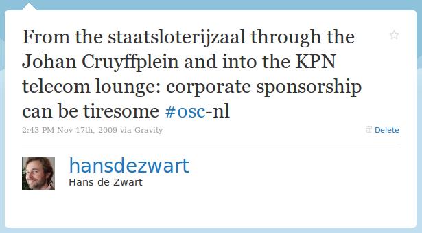
Corporate Sponsorship

However the fact that it is Microsoft sponsoring an open source event is pretty new to me and apparently something we should be getting used to.

3. ijansch: #drupaljam dangerous question in opening. ‘how many women are here’ is so eighties… Make them feel normal, not special.
Women in technology is a pretty contentious topic. Ada Lovelace day has just passed and could be seen as a symptom of more ground needing to be covered. DrupalJam did not have a lot of women attending. As nooble wrote: Op #drupaljam met 2^8 mannen en 2^2 vrouwen (“At #drupaljam with 2^8 men and 2^2 women”). I agree with ijansch that the organiser did a terrible job in the way that they brought this to the attention of the complete audience. Instead they should have asked themselves why this is the case and how it can be changed for the next event. I’ve recently listened to two podcasts that discuss women in technology as a (sub)topic: FreeBDSgirl and Fernanda Weiden both on Floss Weekly. Another interesting project to stay in touch with is Women & Mozilla. Open source projects should never forget that there are also many other diversity and inclusiveness lenses to take into account outside of gender.

4. ijansch: Would be nice if #drupaljam was on http://joind.in for talk ratings
It is always nice to learn about a new web service through a tweet. I checked out Joind.in and have decided to register for an account and try and use it at the next conference I am organising (Moodlemoot on May 26th). Joind.in allows you to add tracks and talks to your event and then provide an easy link to a summary, slides on Slideshare and a way to score and comment on the talk. They have an iPhone app and an open API (so other apps should be on their way). The only thing that might be a problem is that it doesn’t seem to allow for localisation: the whole site is in English, making Dutch summaries stand out a bit.

5. ekes: apache solr stats #drupal understand what people look for on your site. Genius. @robertDouglass #drupaljam
The first tweet that has any relation to Drupal. Apache Solr is an interesting Apache project that sits on top of the Lucene search engine library. It is a very fully featured and fast search platform with things like faceted search out of the box. There is a Drupal project that integrates Solr with Drupal, bringing very rich search functionality to any Drupal website. Good stuff!

6. askibinski: Just learned about the ‘Levensthein distance’. A way to compare similarities between strings. #drupaljam
This tweet had me whipping out my phone to do a Wikipedia search (I use the excellent and free Wikipanion app for that) on Levensthein distance. It is a way to see how similar two strings of text are measured by their edit distance: how many steps do you need to transform one string into another. I have no idea why this concept came up during DrupalJam (I wasn’t at the talk), but I do now have another trivia under my belt.

7. bramveen: Maybe the speaker should remove his chewing gum #drupaljam
Every open source project seems to have a least one “rock star” and Morten Heide self-named “King of Denmark” was the rock star of the day. Morten loves umlauts, the name of his company is “geek Röyale“, and his two favourite words are “awesöme” and “shit”.

Morten's Cöntact form

Morten is a web designer and was giving the final talk of the day, speaking about the new way of doing themes in the as yet unreleased Drupal 7. The only problem with the talk was that Morten was chewing gum while talking. That and the rest of his behaviour turned the talk into more of a show about Morten then a talk about Drupal theming. Afterwards Mortendk showed some remorse on Twitter: #drupaljam next time im gonna drop The gum it was an #epicfail hope ppl got The awesome shit in drupal 7 anyways. I would say: Keep the gum, the world needs more completely self-involved rock stars…

Kaizen versus Good Enough

Arjen Vrielink and I write a monthly series titled: Parallax. We both agree on a title for the post and on some other arbitrary restrictions to induce our creative process. For this post we agreed to write about how Kaizen (the philosophy of continuous improvement) relates to the rise of the Good Enough paradigm. The post also has to include a non-digital example of Kaizen versus Good Enough. You can read Arjen’s post with the same title here.

The world is full of badly designed things. I find this infuriating. A little bit of thought by the designer could make many things so much easier to use. My favourite book on this topic is The Design of Everyday Things by Donald Norman. It is years ago since I read the book, but I can still remember Norman agitating against all kind of design flaws: why would an object as simple as a door need a manual (“push”). I have therefore decided to start a new Twitter account titled unusablestuff in which I post pictures of things that fail to be usable.

Through Alper I recently learnt about the Japanese concept of Kaizen. This is a philosophy of continuous improvement that aims to eliminate waste (wasted time, wasted costs, wasted opportunities, etc.). Kaizen as described on Wikipedia is very much a particular process that you can go through with a group of people:

Kaizen is a daily activity, the purpose of which goes beyond simple productivity improvement. It is also a process that, when done correctly, humanizes the workplace, eliminates overly hard work [..], and teaches people how to perform experiments on their work using the scientific method and how to learn to spot and eliminate waste in business processes.

I’d also like to see it as being a mindset.

Another thing I recently read was a Wired article titled: The Good Enough Revolution: When Cheap and Simple is just Fine.

Cheap, fast, simple tools are suddenly everywhere. We get our breaking news from blogs, we make spotty long-distance calls on Skype, we watch video on small computer screens rather than TVs, and more and more of us are carrying around dinky, low-power netbook computers that are just good enough to meet our surfing and emailing needs. The low end has never been riding higher. […]
what consumers want from the products and services they buy is fundamentally changing. We now favor flexibility over high fidelity, convenience over features, quick and dirty over slow and polished. Having it here and now is more important than having it perfect. These changes run so deep and wide, they’re actually altering what we mean when we describe a product as “high-quality.”

The article is full of examples where cheap, convenient and fast wins out over high quality. Think netbooks, MP3 files and the Flip videocamera.

Both ideas have their appeal to me, but at a superficial level they might seem to contradict each other. Why would you spend a lot of time trying to continually improve on something, when good enough is just good enough? This contradiction isn’t truly there. Good enough is essentially relevant at a higher level than Kaizen. Good enough means you design for a specific task, context, audience or zeitgeist and don’t add things that aren’t necessary. It is about simplicity and lowering the costs, but not about lowering the design effort. Kaizen is about the details: once you have decided to build a netbook (smaller screen, less processing power, but good enough for basic browsing on the net), you should still make sure to design it in such a way that people can use with a little waste as possible.

Oscar in the classic bin

Let’s look at garbage bins as an example. A garbage bin is a relatively simple product. It is a bin with a lid that can hold a bag in which you put the garbage. Oscar lives in one of the classic bins. In essence this is good enough. You don’t need auto-incinerators, sensors that tell you when the bag is full, odour protection, etc. The simple bin-lid-bag concept does have a couple of issues and problems that can be solved with good design.

The Brabantia 30 liter Retro Bin is a bin that has done exactly this. What problems are solved with the design of this bin and how?

Problem: Sometimes you need two hands to get your garbage in the bin. If you have to scrape some leftover peels from a cutting board for example. In that case you have no hands free to lift the lid of the bin.
Solution: You create a bin with a foot-pedal. A foot-pedal also keeps you hands clean as you don’t have to touch the lid of the bin which is often dirty.

Problem: When the bin is empty, pressing the pedal might make the bin move.
Solution: A rubber ring at the bottom prevents the bin from moving on any flooring.

Brabantia Retro Bin
Brabantia Retro Bin

Problem: It can be irritating to constantly have to press the pedal if you want to throw away multiple things and have to walk back and forth to get the garbage to throw in the bin.
Solution: Hinge the lid in such a way that if it opens all the way it stays open. Allow this to be done by a persistent movement of the foot on the pedal.

Problem: If the bag gets really full (by pressing down the garbage) it might press against the mechanism that is used to open the bin, making it hard to open.
Solution: Make sure that the mechanism for opening the lid on the basis of the pedal movement lies completely outside of the bin and is unaffected by the pressure.

Problem: When you put in a new bag it often happens that there is air trapped between the bag and the bin. This makes it hard to throw aways things as the full space of the bag is not used.
Solution: Put little holes in the top of the bags. This allows the air to escape when putting in a new bag.

Problem: There is often a vacuüm between the bag and the bin when you try to lift a full bag out. This gives you the feeling that the bag is stuck.
Solution: Have little holes in bottom of the sides of the bin. This way air can come in, preventing the vacuüm. Brabantia rightly thought that holes at the side of a bin look a bit weird, so they have created an inner bin and outer bin. This also solves an aesthetic (if not design) problem: the top edge of the bag being shown. This top edge now hides between the inner and the outer bin.

Problem: A lot of garbage has some liquid components. These liquids sometimes drip from the bottom of the bag.
Solution: Create an extra strong bottom for the bag of an extra impenetrable plastic.

Problem: When a bag is full it can be hard to tie it up.
Solution: First make sure that the bag is slightly bigger than the bin. Once the bag is out of the bin, the garbage has more space to spread and the top of the bag will have more space to tie up. Next, have a built-in string that can be used to tie up the bag (also highly useful for lifting out the bag). Make sure that this string is long enough to make for an easy knot.

I have had all these problems with garbage bins at some point, the Brabantia bin solves them all.

Many people will probably consider me a whiner (there are bigger problems in the world, can’t you get over these minor garbage issues?) or a weirdo (garbage bins, honestly?) and both are probably true, but that doesn’t negate my point. Getting a product on the market requires that is designed. Now think about the extra design effort to create a bin that solves common bin problems. How many more man months for the Brabantia design than for the classic “Oscar bin”? Now imagine the small problems that a user of a classic garbage bin encounters and multiply them by all the garbage bin users in this world. Any idea how many times an hour something is spilled in this world because there is no pedal on the bin? People like to blame themselves (“I am so terribly clumsy”), I like to blame the designer. Why not just spend some extra design effort and get it right?

I want to draw an analogy with the design of software. I think the believe in Kaizen is what makes Apple products stand out. The example I love to show people is the difference in the calculator on the Symbian S60 3rd edition (I used it on the Nokia E71, my previous phone) and on the iPhone (my current phone).

A calculator is a simple thing. Most people only need addition, subtraction, multiplication and division capabilities. Both default calculators deliver exactly this functionality. Nokia’s effort looks like this:

Nokia's default calculator

You need to use the keyboard (there are designated keys for the numbers) and the D-pad to make a calculation. The D-pad is necessary to navigate from one operator to the next. To do a simple calculation like 6 / 2 = 3 requires you to press eleven buttons!

The iPhone calculator looks like this:

iPhone's default calculator

You just use your finger to tap the right numbers and operators. 6 / 2 = 3 only requires four finger taps.

It is not just the touch interface that makes it possible to have a great working calculator. I managed to download another calculator for the Nokia phone, Calcium. It looks like this:

Calcium calculator
Calcium calculator

This calculator makes clever use of natural mapping to create a calculator that is as easy, if not easier, to use as Apple’s calculator. 6 / 2 = 3 takes indeed four button presses. Nokia could have made this. The fact that Nokia was willing to ship a phone with the default calculator as it was is one of the reasons why I have a hard time believing they have a bright future in the smartphone space.

In a next post I might rant about how many designers think the whole world is right-handed. Do you have any thoughts on design?

(Auto) Presence: Increasing Team and Network (Communication) Efficiency and Productivity

Arjen Vrielink and I write a monthly series titled: Parallax. We both agree on a title for the post and on some other arbitrary restrictions to induce our creative process. For this post we agreed to write about how (auto)presence could increase team and network communication. The post also has to include some video or audio. You can read Arjen’s post with the same title here.

I decided to put this month’s blogpost in a 17 minute long Slideshare presentation (download the 1.5MB PDF here):

[slideshare id=3049248&doc=presence-100201150604-phpapp01]

My voice was recorded with VR+ on the iPhone. This cheap app converts the file to MP3 and allows you to upload it over wifi. The MP3 file is hosted by the Internet Archive.

I would love your comments and ideas on this matter!

The Influence of a Workspace On Performance

Arjen Vrielink and I write a monthly series titled: Parallax. We both agree on a title for the post and on some other arbitrary restrictions to induce our creative process. For this post we agreed to write about the influence of a workspace on performance. The discussion should build on the ideas set forth in a previous parallax post Planning your Career or the Boundary between Private and Professional life. You can read Arjen’s post with the same title here.

I have written before about the direct influence of our environment on our behaviour. I think learning professionals can learn a lot from people like Hans Monderman. This traffic engineer looked with a fresh eye at how people and technology relate to each other. This led to some ground-breaking traffic concepts (quote from Wikipedia):

His most famous design approach is Shared Space, also known as designing for negotiation or Shared Streets. Monderman found that the traffic efficiency and safety of urban streets improved when the street and surrounding public space was redesigned to encourage each person to negotiate their movement directly with others. Shared Space designs typically call for removing regulatory traffic control features (such as kerbs, lane markings, signs and lights) and replacing intersections with roundabouts.

The Architecture of Happiness

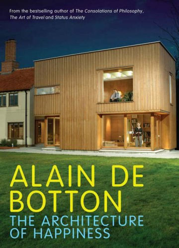
Our surroundings change who we are. I was therefore delighted to learn that Alain de Botton has written a book about exactly this topic, applying it to the architectural domain: The Architecture of Happiness. In it he writes about one of my favourite architectural topics: Le Corbusier and his plans for the Radiant City:

By building upwards, two problems would be resolved at a stroke: overcrowding and urban sprawl. With room enough for everyone in towers, there would be no need for cities to spread outwards and devour the countryside in the process. ‘We must eliminate the suburbs,’ recommend Le Corbusier, whose objection was as much based on his hatred of what he took to be the narrow mental outlook of suburbanites as on the aesthetics of their picket-fenced villas. In the new kind of city, the pleasures of the town would be available to all. Despite a population density of 1,000 per hectare, everyone would be comfortably housed. Even the concierge would have his own study, added Le Corbusier.

There would be ample green space as well, as up to 50 per cent of urban land would be devoted to parks – for, as the architect put it, ‘the sports ground must be at the door of the house.’ What was more, the new city would not merely have parks; it would itself be a vast park, with large towers dotted among the trees. On the roofs of the apartment blocks, there would be games of tennis, and sunbathing on the shores of the artificial beaches.

Simultaneously, Le Corbusier planned to abolish the city street: ‘Our streets no longer work. Streets are an obsolete notion. There ought not to be such things as streets; we have to create something that will replace them.’ He witheringly pointed out that the design of Paris’s street plan dated from the middle of the sixteenth century, when ‘the only wheeled traffic consisted of two vehicles, the Queen’s coach and that of the Princess Diane.’ He resented the fact that the legitimate demands of both cars and people were constantly and needlessly compromised, and he therefore recommended that the two henceforth be separated. In the new city, people would have footpaths all to themselves, winding through woods and forests (‘No pedestrian will ever meet an automobile, ever!’), while cars would enjoy massive and dedicated motorways, with smooth, curving interchanges, thus guaranteeing that no driver would ever have to slow down for the sake of a pedestrian. [..]

The division of cars and people was but one element in Le Corbusier’s plan for a thoroughgoing reorganisation of the life in the new city. All functions would now be untangled. There would no longer be factories, for example, in the middle of residential areas, thus no more forging of iron while children were trying to sleep nearby.

This rational (at first sight) design for cities has an intuitive appeal. It is therefore not surprising that many municipalities have created whole neighbourhoods according to Le Corbusier’s principles. I have worked in one of these neighbourhoods for many years: the Bijlmer. The Bijlmer can be considered an urban design failure. Its giant apartment flats have mostly been demolished or rebuilt within the first 30 years of their existence.

Urban planners could (should?) have known better. Jane Jacobs wrote The Death and Life of Great American Cities in 1961, delivering a damning critique of Le Corbusier’s idea of separating the different functions of a city. De Botton writes it down very elegantly too (apologies for another long quote, I think they are worthwhile though!):

Ironically, what Le Corbusier’s dreams helped to generate were the dystopian housing estates that now ring historic Paris, the waste lands from which tourist avert their eyes in confused horror and disbelief on their way into the city. To take an overland train to the most violent and degraded of these places is to realise all that Le Corbusier forgot about architecture and, in a wider sense, about human nature.

For example, he forgot how tricky it is when just a few of one’s 2,699 neighbours decide to throw a party or buy a handgun. He forgot how drab reinforced concrete can seem under a grey sky. He forgot how awkward it is when someone lights a fire in the lift and home is on the fourty-fourth floor. He forgot, too, that while there is much to have about slums, one things we don’t mind about them is their street plan. We appreciate buildings which form continuous lines around us and make us feel as safe in the open air as we do in a room. There is something enervating about a landscape neither predominantly free of buildings nor tightly compacted, but littered with towers distributed without respect for edges or lines, a landscape which denies us the true pleasures of both nature and urbanisation. And because such an environment is uncomfortable, there is always a greater risk that people will respond abusively to it, that they will come to the ragged patches of earth between their towers and urinate on tyres, burn cars, inject drugs – and express all the darkest sides of their nature against which the scenery can mount no protest.

In his haste to distinguish cars from pedestrians, Le Corbusier also lost sight of the curious codependence of these two apparently antithetical forces. He forgot that without pedestrians to slow them down, cars are apt to go too fast and kill their drivers, and that without the eyes of cars on them, pedestrians can feel vulnerable and isolated. We admire New York precisely because the traffic and crowds have been coerced into a difficult but fruitful alliance.

A city laid out on apparently rational grounds, where different specialised facilities (the houses, the shopping centre, the library) are separated from one another across a vast terrain connected by motorways, deprives its inhabitants of the pleasure of incidental discoveries and presupposes that we march from place to place with a sense of unflagging purpose. But whereas we may leave the house with the ostensible object of consulting a book in a library, we may nevertheless be delighted on the way by the sight of the fishmonger laying out his startled, bug-eyed catch on sheets of ice, by workmen, hoisting patterned sofas into apartment blocks, by leaves opening their tender green palms to the spring sunshine, or by a girl with chestnut hair and glasses reading a book at the bus stop.

The addition of shops and offices adds a degree of excitement to otherwise inert, dormitory areas. Contact, even of the most casual kind, with commercial enterprises gives us a transfusion of an energy we are not always capable of producing ourselves. Waking up isolated and confused at three in the morning, we can look out of the window and draw solace from the blinking neon signs in a storefront across the road, advertising bottled beer or twenty-four-hour pizza and, in their peculiar way, evoking a comforting human presence through the paranoid early hours.

All of this, Le Corbusier forgot – as architects often will.

This is a very long pre-amble to the topic at hand: how the workspace can affect performance.

Shell's Learning Centre in Rijswijk

Most of my time I work in an office in Rijswijk that has been designed by David Leon. The longer I work there, the more impressed I have become by the attention to detail of its indoor design. The designers obviously have a very deep understanding of how people work nowadays and have created a work environment that enables people to get the best out of their day. How is this done?

  • The office space is open (no cubicles), but permanent storage areas and desks have been placed in such a way that privacy is ensured.
  • There are a multitude of different flexible rooms available: cockpits for one person (ideal for when you need to concentrate on getting something done), small rooms with two low chairs (great for having an informal chat), rooms with a table and a cornered bench (excellent for small brainstorms) and bigger rooms with oval meeting tables (sometimes with video calling facility). We even have rooms with wacky furniture to get the creativity going.
  • Connectivity in each room and at each desk. There are docking stations everywhere and each room has a speaker phone.
  • There is a lot of transparency: doors are made of glass and most meeting rooms are like semi-fishbowls with one or more walls completely done in glass.
  • The finishing is meticulous and natural. The orange colour is relaxing, cupboards have a wood finishing and in the heavy traffic areas (where carpeting can’t work) there are beautiful black natural stone tiles.
  • The overall layout allows small work communities (10-20 people) to form naturally. These work communities then share elevators, toilets, kitchen areas, allowing for broader networking too.

There are many similarities with the post I wrote about planning your career. Many of the things that keep you in the “Hooray!” zone on a career (macro level) are also relevant on the micro level when it comes to doing day-to-day work. Transparency, flexibility, the opportunities for networking and the use of technology are what make my office great.

People, Place, Process
People, Place, Process by David Leon

My company seems to understand this too. There is a reason why they hired David Leon, who write on their website:

Innovation depends on bright people. These people cost more and are far more valuable than the buildings they occupy… but it is a proven fact that the environment in which they work has a major impact on their effectiveness.

For that reason we design workplaces and buildings round the needs of people and the business aims of their organisations.

It is therefore stupefying that I am forced to use a locked down version of Microsoft Windows 2000 with Internet Explorer 6 as a primary workspace every single day of my working life (currently all employees are migrating to a locked down version MS Vista, this should be finished by the end of the first quarter). I think this is a big mistake and know that many people are not as productive as they could have been because of this.

I estimate that I am about 50% more productive on a laptop that is exactly configured to my specifications. The ability to use the applications that I want on the operating system that I prefer (that would be Ubuntu) would make a huge difference. It is the small details that make all the difference. I can’t use my normal keyboard shortcuts, I don’t have access to the command line to do things in batch, I don’t have a decent browser, I cannot edit images; I could go on much longer.

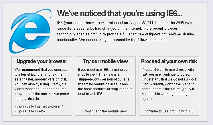
Many of the sites I need to look at don’t even work on IE6 anymore. The other day I browsed to drop.io from work and got the following message:

drop.io IE6 message
drop.io IE6 message (click to enlarge)

Embarrassing right?

So, here is my recommendation to all companies:

At all times allow your employees the freedom to use the technology they want

Yes, this means that you cannot standardise on hardware and software.

Yes, this means you have to allow access to your network from the device that your employee chooses.

Yes, this means you will have to support open standards so that people with a Mac or running Linux can access your applications.

Yes, you will need more bandwidth because you will have to allow YouTube and Facebook.

Yes, you will have extra costs because of all this.

But these extra costs will easily be offset by the extra productivity that your employees can deliver for you. In a couple of years it might actually become difficult to find employees that want to work for your company if you don’t heed to this recommendation.

Is your productivity affected by your workspace? Does your company allow you to choose your hardware? Can you install the software that you want and/or need? I look forward to any comments.

A Design Concept For a Mobile Moodle Application

Arjen Vrielink and I write a monthly series titled: Parallax. We both agree on a title for the post and on some other arbitrary restrictions to induce our creative process. For this post we agreed to create a design concept for a mobile Moodle application. The concept should include screen mockups. You can read Arjen’s post with the same title here. This month we are delighted to have two guest writers writing about the same topic. Marcel de Leeuwe (read his post here) and Job Bilsen (his post can be found here).

Mobile applications have taken off. This is largely due to the trailblazing work that Apple has done with the iPhone and the App Store. If you have been watching my Delicious feed, you will have noticed that I too have succumbed and will be part of the iPhone-toting crowd (I will write more about me losing my principles later).
Nearly every web service that I use has a mobile application. Examples are Last.fm, Flickr, WordPress, Dropbox, NY times, Paypal and more, the list is endless. Moodle, the web application that I use most often, does not have a mobile app yet. There have been a couple attempts at creating themes that display well on a mobile (such as here). These mobile themes usually try to deliver all of Moodle’s functionality, which often limits their phone specific interaction and their user friendliness. Other applications use JAVA applications that gives people access to specific Moodle functionality (examples here and here).

It would be great to have a true mobile Moodle application. Here are some initial thoughts for a design.

Audience
The audience for this Moodle application would mainly be students/participants. I want the functionality to focus on things that are easily delivered on a mobile platform. I don’t think grading and reporting interfaces lend themselves well to a smaller screen. The things that people like to do with a mobile device are usually: seeing what has happened/is happening, plan and communicate. This Moodle application will enable the users of a Moodle installation to do exactly those things.

Getting rid of the course paradigm
Moodle is extremely course centric. I have always thought that this has some great advantages, mainly that all the learning is very contextual. Students, however, often have to “multi-course” (doing multiple courses at the same time). A mobile application should make the most urgent or current events, actions and resources bubble to the top. This requires the application to get rid of the course paradigm and show a personal page per user.
People that have used Moodle for a while might know of the “My Moodle” page. This page also tried to pull up the most relevant information for a particular user, but would still display this information on a course by course basis.

This application will consist of four main screens. Each screen has its own icon at the bottom of the screen that stays available at all times. Each screen could of course lead to other screens that take you deeper into the Moodle installation.

1. Recent activity stream
Facebook and Twitter have really taught us the use of activity streams. These pages display short status messages about what is happening in reverse chronological order. Moodle has had an activity stream since its inception: the recent activity block. This block shows what has been happening in a particular course. Examples are forum posts, work being handed in or materials being added by the teacher.
This screen will work in a similar way, but will include all the courses a user is participating in. I would imagine that each update on the screen would include a date and a time, would link to an extended version of the update and would include a user image if the update concerns another user, or an activity icon if it concerns a particular activity. The newest updates would be at the top of the screen and the user would be able to scroll down to see older entries (very similar to Twitter). See below for an example:

Recent Activity
Recent Activity

You would have to think about each Moodle module and decide what a status update would look like for that particular module. Some examples of events that could trigger a status update:

  • A forum post is added to a course of which the user is a member.
  • An activity becomes available (either because it was added or because it had certain time that it would become available, like the choice or assignment activity) or a deadline has passed.
  • An entry is added to a database activity or a glossary that the user has access to.
  • A topic or week has been made current by the teacher/facilitator.
  • A message has been sent to the user.
  • The user hands in work for an assignment, fills in a choice, starts a lesson, gets the results for a quiz or starts a SCORM object.
  • A change is made to a wiki page that the user has access to.

These status updates could announce themselves on the home screen in a similar way to how the mobile platform shows that you have new email messages: by showing how many new updates are available.

2. Upcoming events
This screen is also an extension of existing Moodle functionality made course independent. Conceptually it is what you would see if you would scroll up on the recent activity screen. Upcoming events that can be displayed are:

  • Anything that is in the user’s calendar.
  • Activities that will become available or that have a deadline.
  • Courses that will start and that the user is enrolled in.

This screen would look very similar to the “Recent Activity” screen as shown above.

3. Social: contacts, interests and messaging
A mobile device is used for communications and a mobile Moodle application should facilitate that. This screen is an alphabetical list of all the users that a student/participant shares a course with, combined with an alphabetical list of all the interests that a user has put in their profile and all the courses the user is enrolled in. See example:

Social
Social

Selecting a user will take you their profile page. This page will focus on the ways that the user can be contacted. You can message the user from here, call (or Skype) them, send them an email and click on the links to their external websites (a blog, Twitter, Facebook, etc.). See this example:

Profile page
Profile page

Selecting an interest or a course will apply a filter to the alphabetical list. It will now only show users that share this interest or this course. It might allow the user to contact all these users in one go (if this role has been given the permission for this capability).

4. Browsing courses, activities and resources
I really like a side scrolling drill down navigation (examples are the way that email works on the iPhone or the “Slider view” on Grazr). A mobile Moodle application should allow the user to navigate to activities and resources in their course by constantly drilling down. This can be done it two ways: course centric or activity-type centric. The application should probably support both.
The first screen shows a list of all the courses the user is participating in and below that a list of all the activity types that exist in Moodle.
Clicking on a course will make the previous screen slide to the left and display a new screen. The first option on this screen will be called “Course overview”. If you click on this you will see all the section/topic summaries, all the activities and resources and all the labels in their correct order (blocks are completely ignored in this mobile application). Below the course overview are links to the overview pages of each activity type. Clicking these will display all the instances of a particular activity or resource.

If you click on an individual activity or resource you will be shown that activity (again by making the screen slide to the left). What is shown here and what interactions are possible is dependent on the activity module. The minimum it would show is the title and the description. This would probably be the case for SCORM modules for example or for “upload a file” assignments. You would not implement a mobile SCORM player, nor will people likely have files for upload on their phone. The one activity that would benefit from being a bit richer would be the forum activity. It should be possible to follow and contribute to a forum discussion from the mobile Moodle application.

Technical considerations
The (start of a) functional design that I describe above will certainly have technical consequences (not to write obstacles). Below some of my first thoughts:

  • What platform? The nice thing about web applications is that you only have to develop them for one single platform: the platform that the server is using. Of course it would be possible to create a mobile version of a Moodle site, but this would negate some of the great things that a native application can do. We are now in the unfortunate situation that we have multiple mobile development platforms. The two obvious choices for mobile development would be an iPhone app and an app for Android. But what about people who use a Blackberry, or a Symbian or Maemo phone? I have no knowledge of how easy it is to port an Android app to the iPhone, but I do know that multiple platforms will be a reality in the next couple of years. You better write portable code!
  • Where does the code live? It is easy for Facebook to create an iPhone application. They run a single installation and can have server-side code and client-side code to make it all work. Moodle’s install base is completely decentralised. That means that Moodle installations will have to get some code that will allow a client to talk to it. In the client you will then need to be able to say what Moodle installation you want to connect to. This poses a couple of questions. Will a mobile Moodle app require a special server module? Will Moodle 2.0 expose enough of itself to an external API to make a client like I describe above possible? Should one client be able to plug into multiple Moodle installations at the same time? I am not a software architect, so I would not have any answers to these questions, but they will need to be resolved.
  • Performance? Moodle’s data structure is course-centric and not user-centric. Moodle currently does not have internal functions that deliver the data in a format that the Moodle client can use. I think that the query to deliver a recent activity feed that is cross-course and has the perspective of a single user is very complex and will create a huge performance hit on the server. Again, I am not an architect, but I would imagine that this requires a special solution. Maybe more push and less pull? More database tables? Server-side pre-caching? Who knows? I certainly don’t!
  • Roles/permissions/capabilities? Any new Moodle client that uses existing Moodle data (as opposed to new modules) needs to be very aware of any existing capabilities. All of these need to be checked before information can be shown to the user. I am sure this has further performance implications.
  • Online/offline? A lot of mobile applications cache their information so that a user can continue to use the application even if an Internet connection is not available (e.g. the New York Times app). Even though it might be useful for a Moodle application too, I wouldn’t put any initial effort into solving that problem. Smartphones that have decent application support function well in a context where there is persistent mobile broadband. It is therefore okay for the first version of mobile Moodle application to assume that it is online.

A note on prototyping/mockups
I used the excellent Balsamiq to create the mockups that go with this post. This easy tool delivers quick static results, although it lacks a bit of precision that I would like to have added. Moodle has Balsamiq integrated into the Moodle Tracker, making it trivial for anybody to add a user interface mockup to any issue. There are other tools that could be used to do iPhone prototyping. This blog post gives a good overview.

Continuing the dialogue
I would really like an application like this (or something similar) to come into existence. I look forward to working with other people with a similar interest (bored developers? Google Summer of Code students?). Let’s make this happen! Any and all comments are welcome…