Unlike the Android marketplace, Apple’s appstore unfortunately does not allow you try out apps for a couple of minutes and get a refund if you don’t like them. After buying an iPad I wanted to have a good Mindmapping app, but I had no idea which of the six or so options would be the best choice for me. I searched for a site that compared them all, but couldn’t find that either. That’s when I decided to buy them all, use them all and review them all on this blog.
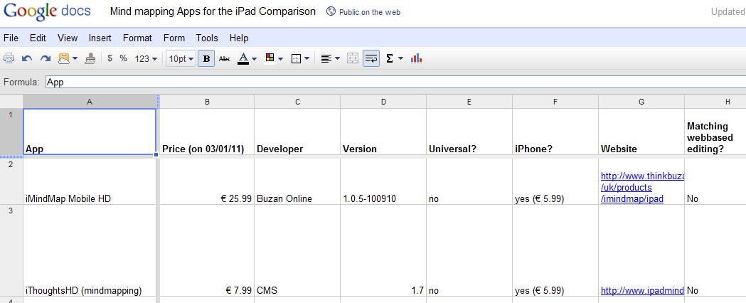
I wanted to make this a definitive review, so I created a companion spreadsheet with all the factual and easily quantifiable information about the different apps. You can find it here (I will not keep it up to date, so if you want to volunteer to do that I can give you access). The spreadsheet will tell you for example whether the app can work with an external screen, if there is an iPhone or Desktop equivalent and what methods and formats are supported for import and export.

For each of the apps I tested how easy it was to learn and to use, how the mindmaps look, whether it is possible to share the maps easily to other users and locations and whether there are any online services that the maps can sync to. I also gave each of the app a rating (10 is marvellous, whereas 1 is horrible).
iMindMap Mobile HD
€ 25.99 by Buzan Online

This is the offering by the company/man who has feverishly tried to copyright mind mapping and has build an accreditation and consultancy business around helping people leverage mind mapping in their work: Tony Buzan.
The stiff price of the app and the “official” stamp sets high expectations. Unfortunately the app doesn’t deliver. At first glance there is a lot of polish and a professional look (i.e. you get instructions on how to use the app with a slick video, the map overview screen with miniature versions of the mind maps is beautiful), but once you start using it, the shine goes away.
The interface is very counterintuitive. Even very experienced computer users might need to watch the video before they start being capable of inputting data using one of the two input methods. Moving nodes around and deleting them is clumsy. The interface for collapsing branches is shockingly bad. Each node can have a colour set and an icon (from a large collection) but cannot have any notes or URLs attached and can have a note or an URL attached (updated after a comment by Tim Smith).
The external presentation mode shows the map on the external screen and allows the iPad user to decide which topic to show. You cannot edit the map while using the external screen.
Overall it feels like this was built on commission by people with no real love for either mind mapping or the iPad. The people who commissioned the creation of the app, assumedly mind mapping experts from Buzan, should look at some of the other mind mapping apps available and learn that it isn’t only looks that are important.
Pros: Beautiful mind maps, “official” app.
Cons: Hard to use, no interoperability, outrageously expensive
Rating: 5/10
iThoughtsHD (mindmapping)
€ 7.99 by CMS

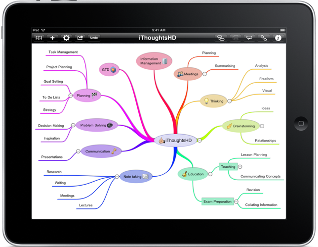
The longer you use this mind mapping app the more you realise that its maker has tried to make the ultimate tool for mind mapping on the iPad. He is striving for perfection and it shows.
Although the app is intuitive to use for beginners, it also has an extensive feature list for power users: From the setting of backgrounds, to keyboard shortcuts (e.g. three times “enter” will create a new sibling node, whereas three times “space” creates a new child).
Maps are organised in folders and can each have an icon for easy recognition. There is no search function yet to find a particular map or its contents.
Adding, moving and copying nodes and branches of nodes is very easy and can be done intuitively in multiple ways. Occasionally the app will misinterpret your intentions, but this is quickly remedied by a quick tap on the undo button.
The nodes can contain all kinds of information, varying from task related items (priority, progress, start- and due date, all with matching icons) to notes, URLs and icons. The colour and shapes are customisable too and can be applied to all children in a branch. It is possible and easy to make links between different nodes. The boundary option is unique and useful: it puts all the nodes in a branch in an outline and colours the background.
iThoughtsHD has its own native file format, but also supports many other mind mapping formats. There are a number of im- and export options. One way that works very well is the Dropbox integration. There is a two-way sync between iThoughtsHD and Dropbox. This is great for backup and also allows an easy way to safely collaborate with someone else on a map using a shared Dropbox folder.
Another iThoughtsHD feature that the other apps are missing is a revision history. iThoughtsHD keeps older versions of your map in case you want to go back in time (although the most recent version of the app seems to have lost this functionality has only made this functionality available when creating a new map (updated after a tweet from the makers of the app)). The app actively advises you not to rely on iTunes for doing a full backup and has a way to send an email with your complete data in an archive. This archive can then be imported in case it is needed.
Pros: Most complete feature set, very rich in its im- and export options
Cons: Could be overkill for some users
Rating: 9/10
Maptini
€ 3.99 by Barking Minds LLC

This app is relatively new (I believe the web service is still in beta). It is a very simple app with an output that looks similar to MindNode (with the concepts/nodes on narrow lines, rather than in rounded boxes).
The main point of Maptini is that allows for very easy collaboration using either the app or the version in the browser (there is even a way to work in mobile safari). It is incredibly quick to make your map completely public and let anyone else with a Maptini account edit the map.
The editing is simple and fast and there is not a lot to worry about: there are just 6 colours and a delete button. The iPad app does not allow any importing and exporting of different mind maps: this all needs to be done through the web interface.
Collaborative editing in realtime does really work as advertised, so if it is important for you to have multiple people work on the same mind map at the same time, then this app is worth a shot.
Pros: made for collaboration
Cons: no other features than basic map-based outlining
Rating: 6/10
MindMeister for iPad
€ 5.99 by MeisterLabs

MindMeister started its life on the web: for a yearly subscription fee you can have an unlimited number of mind maps stored online, accessible and editable through any modern browser and sharable with others for realtime collaborative work.
This web-based experience is now also available on mobile devices. The iPad app does not require a subscription with the web-service, but will only allow you to sync six mind maps from the iPad to your online account if you aren’t a subscriber (while not being completely transparent about how to influence which six maps will synched).
Like most (but not all) apps, MindMeister uses the model where you select a node and then click a “plus” to create a child of this node. This means that it always takes two taps to add a child, but what you lose in the number of taps, you gain in consistency. Moving nodes around is easy and the dedicated trashcan button is smartly put far away from the other node-related buttons in the interface. An undo button seems to be missing.
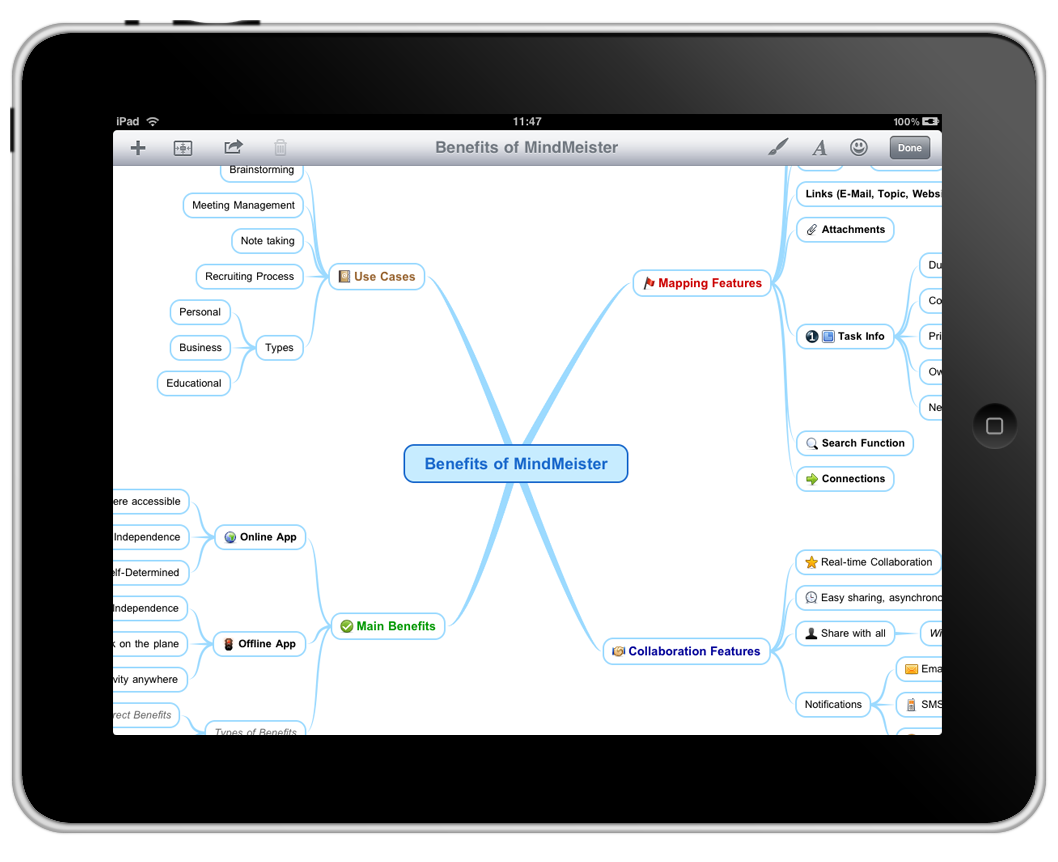
Nodes can be linked to each other, but it is not clear how to remove these links once you have created them (is this possible at all?). There is a good set of icons, the colour is flexible (you can even theme the whole map in one go), you can create direct links to URLs and email addresses and there are task related options. Tasks is something where MindMeister really shines: not only can you note the start/due date, priority, effort and completion, you can also assign the task to other MindMeister users. These tasks then sync to the web and people will get reminders when tasks are due.
The tasks functionality points to the ideal use case for MindMeister: if you work in a small team you could use it for all the minutes of meetings, for all the notes and for all the planning. The collaborative sharing would allow everybody to have the same view. When working through the browser the online collaboration works as fast as GoogleDocs (near instant synchronisation), on the iPad it seems to update a bit slower making it less easy to use with a virtual team.
The “Geistesblitz” functionality gets a lot of marketing in the description in the appstore, but is less useful than it is made out to be. What it allows you to do is to assign a default mind map (this needs to be done online). Whatever you then add in the Geistesblitz screen is added as a child of the “Geistesblitz” node in this default app. Most people will have another app to capture random notes and thoughts like this.
Most other apps with external screen support keep the iPad screen the same and display a version of the map (without any interface elements) on the external screen. MindMeister shows the complete iPad screen on the external screen, including all interface elements.
Rating: 8/10
MindNode
€ 4.99 by Markus Müller

This is very slick app that is very intuitive and quick to use. The feature set is light: it is impossible to do anything else with a node but give it a colour and there are limited options for im- and export. What it does, it does exceptionally well: it is easy to add nodes and delete them (there is an undo and a dedicated delete button) and moving a node takes no effort too.
The thin and freshly coloured lines on which the text is written are pleasing to the eye. The one thing that could be improved is the fact that auto-lay-outing (the app calls it reorganising) has to be triggered manually whenever the map gets too messy: there is no way to have the app do it continuously.
In most cases a mind map is nothing more than a hierarchical outline and could alternatively be displayed as an indented list. Kudos to MindNode for providing an easy way to navigate the map in list form and to provide a search box allowing you to quickly find a particular piece of information in a large map.
The app allows you to save maps to Dropbox in different formats, but this is only a one-way street: there is no easy way to import maps from Dropbox in a similar manner. This is one of the few apps that supports printing. There is no easy way for collaborative editing.
Pros: Very fast and minimal interface
Cons: Light on features with no advanced lay-out option or “intelligent nodes”
Rating: 7/10
Total Recall
€ 0 for three maps, € 0.79 for unlimited maps by Zyense

The opening map of this mind mapping app has a bit of a childish look (probably caused by the pastel colours and the bubbly nodes). The app is very simple in its functionality.
Each of the bubbles (nodes) can have its colour set and can be connected to any of the other bubbles. These connections are many to many, so with Total Recall you aren’t stuck with a purely hierarchical system, but can create real networks too. Because of this, the automatic lay-outing algorithm is interesting: you press play to start it, after which it starts pulling on all the connections until it has reached some form of equilibrium.
There is no support for an external screen and no other way than email to collaborate with other users.
Pros: Cheap, ability to have multiple connections between nodes
Cons: Very limited functionality, not very fast to use
Rating: 5/10
Trout
€ 1.59 by Digital-Dirtbag

This is definitely the odd one out in this list of apps. Trout is not made to be similar to anything else, instead it looks and feels like it was written to solve the knowledge management issues that the author himself must have had.
In one way that is great: this is the only app that allows you to record sound snippets with each of the nodes and to add images that can be zoomed. There is an interesting quick direct link to Google search results for the words in the node and the way that you can add your own meaning to both colours and icons is refreshing.
On the other hand it also a bit of a hindrance: this is one of the hardest apps to come to grips with and some of the icons on the buttons are really unclear. There is little or no documentation, so you are left to yourself to find out what a “model” is and how to work with defining icons that can then be sorted in the list view.
This app would mainly be recommended to curious minds.
Pros: Ability to record sound and upload images
Cons: Unclear interface
Rating: 6.5/10
The Verdict:
Three of these tools are really viable for everyday use. If you are interested in a very quick and clean solution that works well, then go for MindNode.
For the individual user who wants to make sure that their maps look good and who needs to be flexible with where the data of the map goes, iThoughtsHD is the best option.
If you work in a small team and you get other people to also subscribe for an account, then MindMeister seems to be the best option.
My costs
It cost me € 51.33 to buy all the apps and do this review of them. As an experiment, I would like the readers of this post to help me carry these costs. Would you be willing to donate a small amount? ((I also would not say “no” to a free MindMeister subscription!). I will remove this button as soon as my costs are recovered. Update 3/1/13: My costs have been recovered (thanks to about 20 generous readers). If you appreciated the reviews, then I would still appreciate a donation.
I have to thank Linux Format for their Roundup feature format, which I used as the inspiration for the way this post is set up.
